
Perfect Dark is perhaps one of the most accomplished games in the N64 library. It built on the solid work seen in the sublime GoldenEye 007, pushing the host hardware to its limits and making excellent use of the N64 Expansion Pak to deliver the kind of visuals that rival systems could only dream of. It remains one of Rare’s best Nintendo efforts, and is fondly remembered by fans even today.
However, there’s one mystery surrounding this game that has bugged us for years: why did such a high-profile release have three different cover designs for its regional releases?
Now, swapping cover artwork isn’t anything new; companies have been doing it for decades. Back in the 16-bit era, it was common to see perfectly good Japanese artwork get replaced by horrendous western efforts, the vast majority of which were almost always inferior to the original.
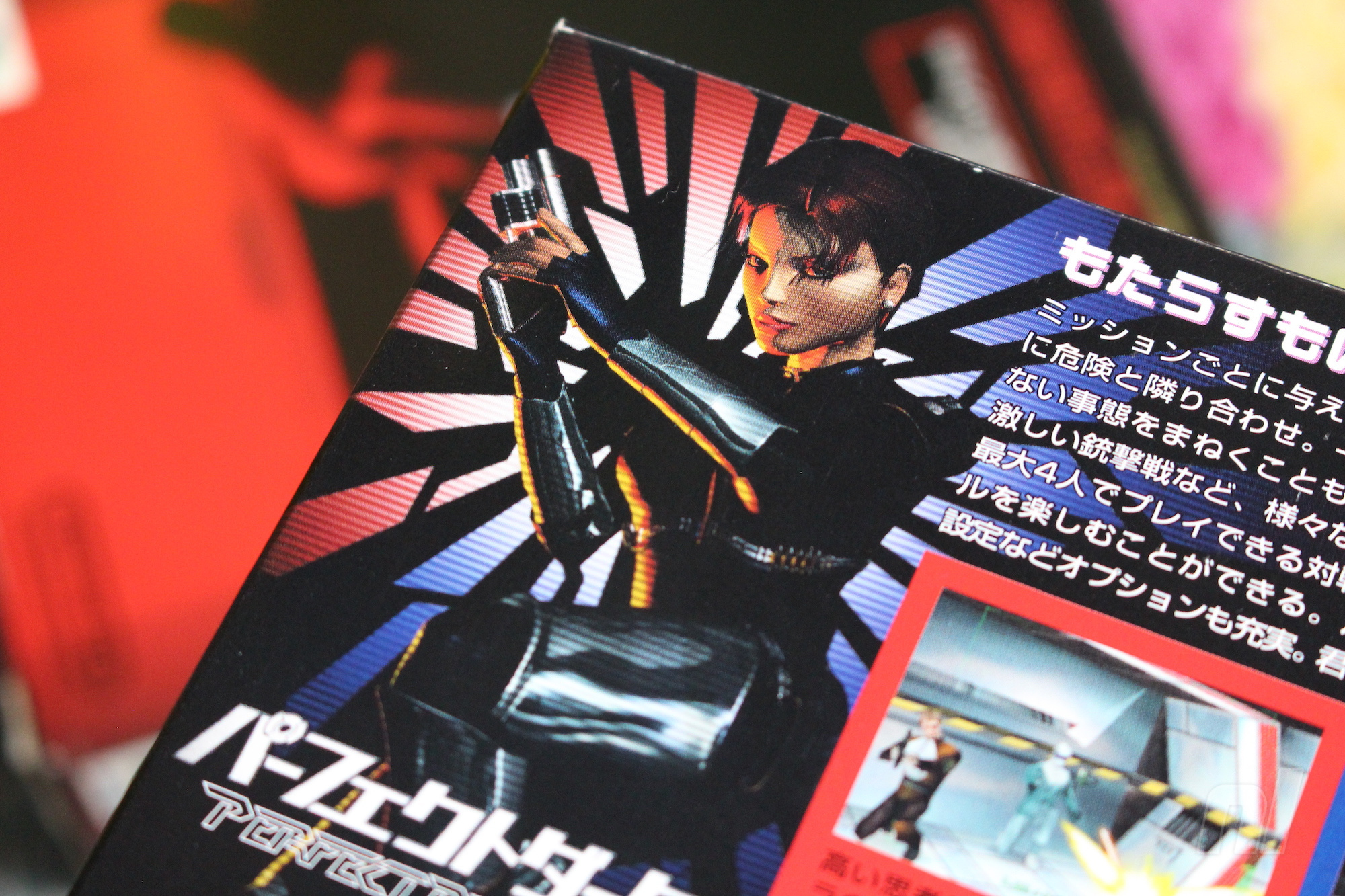
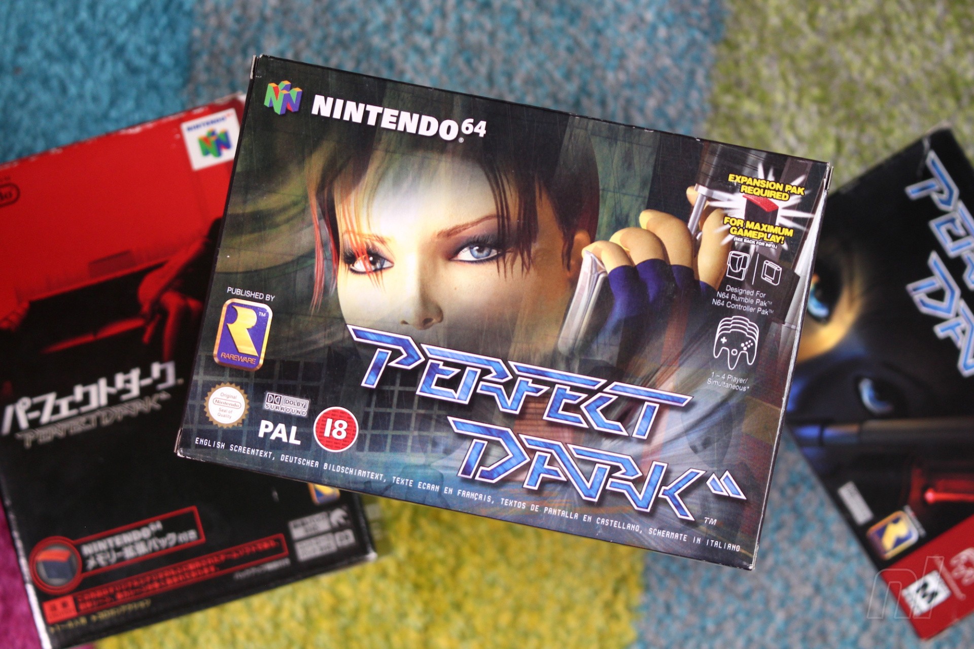
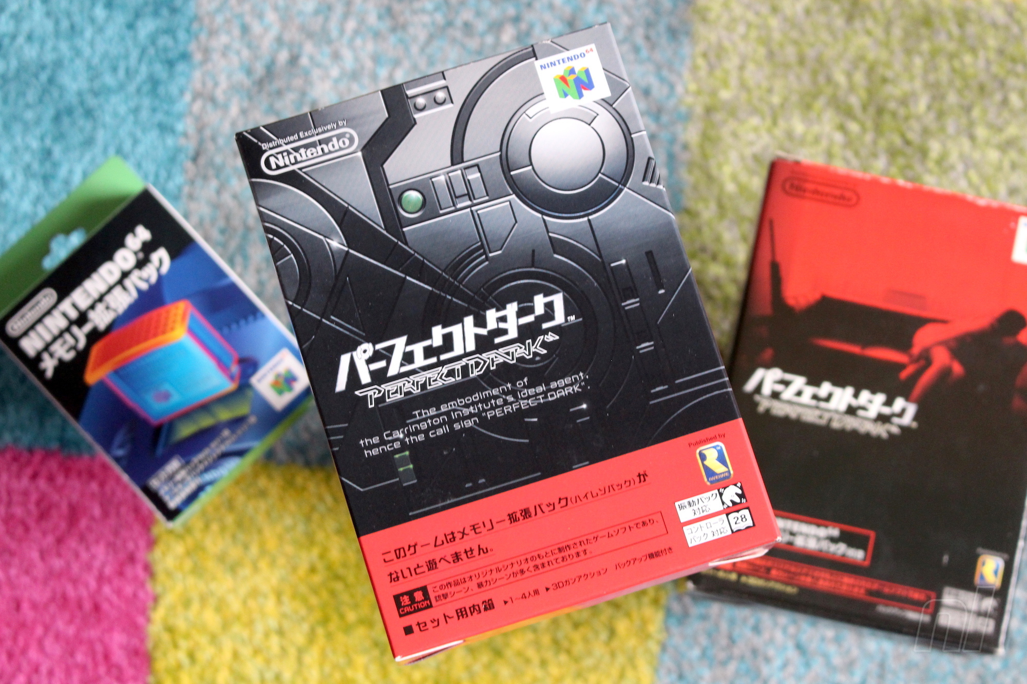
However, Perfect Dark is unusual in that the North American and European boxes have different (but thematically similar) designs, whereas the Japanese box opts for a totally unique red-and-black image which is perhaps the best of the lot; it shows Joanna Dark reclining on a sofa, gun in hand and sniper rifle nearby. It’s one of the most understated covers you’ll see for any home console AAA action title, and it works brilliantly – but why was it used for the Japanese version, and why did the western releases use two different takes on the same design?
We needed the US one ultra quick and there was no model at all to use for the artwork
Keen to get to the bottom of all of this (because we’re sad like that), we got in touch with former Rare Art Director Kev Bayliss. It turns out that Bayliss – who now works at Yooka-Laylee studio Playtonic Games, along with many other Rare alumni – was involved with the creation of the two western covers.
“We needed the US one ultra quick and there was no model at all to use for the artwork,” he explains. “So I had to quickly make some eyes and create a box art in about a day. That’s what we ended up with and as a consequence of that, I was given the task of creating a proper Joanna Dark model – so that’s when I got involved in the series. I made the model that was then used for the European box art and all promo material at the time.”
Sadly, Bayliss is at a loss when it comes to explaining why the Japanese version of the game doesn’t use the same cover art. He asserts that the decision to use a completely different image was entirely Nintendo’s, not Rare’s. Still, Bayliss approves of the choice.
I love that there are three different pieces of artwork for the game
“I’d never seen the Japanese box art until I saw it on fellow Rare staffer Simon Farmer’s shelf one day, and I loved the artwork style,” he says. “In fact, I was really close to buying a mint condition boxed Japanese copy a few months ago for about £60 but I got wrapped up in moving house so I put it on hold. I love that there are three different pieces of artwork for the game, but I kind of like the European one I did. It was a bit more realistic than the Killer Instinct models I’d made Previously.”
So there you have it; the North American box has a different main image because there wasn’t a ‘cover-worthy’ version of Joanna Dark available until Bayliss quickly put one together, and the reason the European cover has different eyes is because it’s based on Bayliss’ more detailed character model – which, ironically, appears on the back of the Japanese packaging. We still don’t know who at NCL is responsible for that amazing Japanese cover, but perhaps one day we’ll find out.