


Too much stuff happening in a single plot? No problem—use multiple subplots!
This in-depth tutorial shows you everything you need to know to get started with Matplotlib’s subplot() function.
If you want, just hit “play” and watch the explainer video. I’ll then guide you through the tutorial:
To create a matplotlib subplot with any number of rows and columns, use the plt.subplot() function.
It takes 3 arguments, all of which are integers and positional only i.e. you cannot use keywords to specify them.
plt.subplot(nrows, ncols, index)
nrows– the number of rowsncols– the number of columnsindex– theSubplotyou want to select (starting from 1 in the top left)
So, plt.subplot(3, 1, 1) has 3 rows, 1 column (a 3 x 1 grid) and selects Subplot with index 1.
After plt.subplot(), code your plot as normal using the plt. functions you know and love. Then, select the next subplot by increasing the index by 1 – plt.subplot(3, 1, 2) selects the second Subplot in a 3 x 1 grid. Once all Subplots have been plotted, call plt.tight_layout() to ensure no parts of the plots overlap. Finally, call plt.show() to display your plot.
# Import necessary modules and (optionally) set Seaborn style

import matplotlib.pyplot as plt

import seaborn as sns; sns.set()

import numpy as np # Generate data to plot

linear = [x for x in range(5)]

square = [x**2 for x in range(5)]

cube = [x**3 for x in range(5)] # 3x1 grid, first subplot

plt.subplot(3, 1, 1)

plt.plot(linear) # 3x1 grid, second subplot

plt.subplot(3, 1, 2)

plt.plot(square) # 3x1 grid, third subplot

plt.subplot(3, 1, 3)

plt.plot(cube) plt.tight_layout()

plt.show()
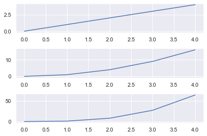
Matplotlib Subplot Example
The arguments for plt.subplot() are intuitive:
plt.subplot(nrows, ncols, index)
The first two – nrows and ncols – stand for the number of rows and number of columns respectively.
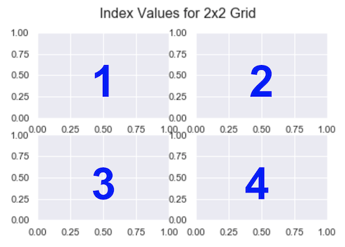
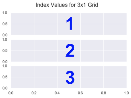
If you want a 2×2 grid, set nrows=2 and ncols=2. For a 3×1 grid, it’s nrows=3 and ncols=1.
The index is the subplot you want to select. The code you write immediately after it is drawn on that subplot. Unlike everything else in the Python universe, indexing starts from 1, not 0. It continues from left-to-right in the same way you read.
So, for a 2 x 2 grid, the indexes are
For a 3 x 1 grid, they are
The arguments for plt.subplot() are positional only. You cannot pass them as keyword arguments.
>>> plt.subplot(nrows=3, ncols=1, index=1)

AttributeError: 'AxesSubplot' object has no property 'nrows'
However, the comma between the values is optional, if each value is an integer less than 10.
Thus, the following are equivalent – they both select index 1 from a 3×1 grid.
plt.subplot(3, 1, 1)

plt.subplot(311)
I will alternate between including and excluding commas to aid your learning.
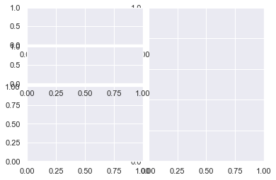
Let’s look at the default subplot layout and the general outline for your code.
plt.subplot(3, 1, 1)

<em># First subplot here</em> plt.subplot(3, 1, 2)

<em># Second subplot here</em> plt.subplot(3, 1, 3)

<em># Third subplot here</em> plt.show()
This looks ok but the x-axis labels are hard to read on the top 2 subplots.
You have a few ways to solve this problem.
First, you can manually adjust the xticks with the matplotlib xticks function – plt.xticks() – and either:
- make them transparent by setting
alpha=0, or - move them and decrease their font size with the
positionandsizearguments
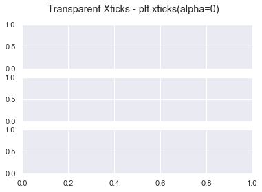
# Make xticks of top 2 subplots transparent

plt.subplot(3, 1, 1)

plt.xticks(alpha=0) plt.subplot(3, 1, 2)

plt.xticks(alpha=0) # Plot nothing on final subplot

plt.subplot(3, 1, 3) plt.suptitle('Transparent Xticks - plt.xticks(alpha=0)')

plt.show()
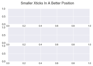
# Move and decrease size of xticks on all subplots

plt.subplot(3, 1, 1)

plt.xticks(position=(0, 0.1), size=10) plt.subplot(3, 1, 2)

plt.xticks(position=(0, 0.1), size=10) plt.subplot(3, 1, 3)

plt.xticks(position=(0, 0.1), size=10) plt.suptitle('Smaller Xticks In A Better Position')

plt.show()
Both these methods work but are fiddly. Plus, you cannot automate them which is annoying for us programmers.
You have this ticks problem whenever you create subplots. Thankfully, the matplotlib tight_layout function was created to solve this.
Matplotlib Tight_Layout
By calling plt.tight_layout(), matplotlib automatically adjusts the following parts of the plot to make sure they don’t overlap:
- axis labels set with
plt.xlabel()andplt.ylabel(), - tick labels set with
plt.xticks()andplt.yticks(), - titles set with
plt.title()andplt.suptitle()
Note that this feature is experimental. It’s not perfect but often does a really good job. Also, note that it does not work too well with legends or colorbars – you’ll see how to work with them later.
Let’s see the most basic example without any labels or titles.
plt.subplot(311)

plt.subplot(312)

plt.subplot(313)

plt.tight_layout()

plt.show()
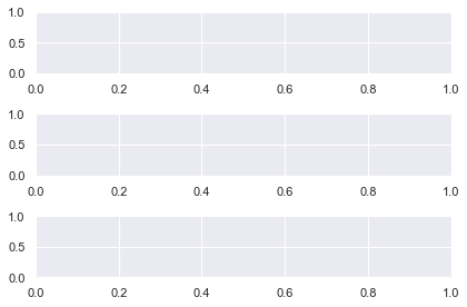
Now there is plenty of space between the plots. You can adjust this with the pad keyword. It accepts a float in the range [0.0, 1.0] and is a fraction of the font size.
plt.subplot(311)

plt.subplot(312)

plt.subplot(313)

plt.tight_layout(pad=0.1)

plt.show()
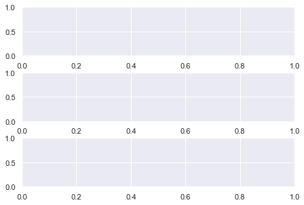
Now there is less space between the plots but everything is still readable. I use plt.tight_layout() in every single plot (without colobars or legends) and I recommend you do as well. It’s an easy way to make your plots look great.
Check out the docs more information and arguments that tight_layout in matplotlib accepts.
Now, let’s look at how to add more info to our subplots in matplotib.
Matplotlib Subplot Title
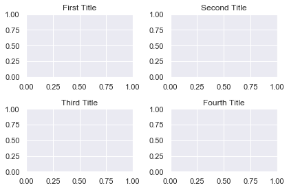
You can add a title to each subplot with the plt.title() function.
plt.subplot(2, 2, 1)

plt.title('First Title') plt.subplot(2, 2, 2)

plt.title('Second Title') plt.subplot(2, 2, 3)

plt.title('Third Title') plt.subplot(2, 2, 4)

plt.title('Fourth Title') plt.tight_layout()

plt.show()
Matplotlib Subplot Overall Title
Add an overall title to a subplot in matplotlib with the plt.suptitle() function (it stands for ‘super title’).
# Same plot as above

plt.subplot(2, 2, 1)

plt.title('First Title') plt.subplot(2, 2, 2)

plt.title('Second Title') plt.subplot(2, 2, 3)

plt.title('Third Title') plt.subplot(2, 2, 4)

plt.title('Fourth Title') # Add overall title to the plot

plt.suptitle('My Lovely Plot')

plt.tight_layout()

plt.show()

Matplotlib Subplot Height
To change the height of a subplot in matplotlib, see the next section.
Matplotlib Subplot Size
You have total control over the size of subplots in matplotlib.
You can either change the size of the entire Figure or the size of the Subplots themselves.
Let’s look at changing the Figure.
Matplotlib Figure Size
First off, what is the Figure? To quote the AnatomyOfMatplotlib:
It is the overall window/page that everything is drawn on. You can have multiple independent figures and
Figurescan contain multipleSubplots
In other words, the Figure is the blank canvas you ‘paint’ all your plots on.
If you are happy with the size of your subplots but you want the final image to be larger/smaller, change the Figure. Do this at the top of your code with the matplotlib figure function – plt.figure().
# Make Figure 3 inches wide and 6 inches long

plt.figure(figsize=(3, 6)) # Create 2x1 grid of subplots

plt.subplot(211)

plt.subplot(212)

plt.show()
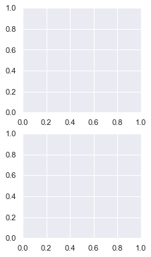
Before coding any subplots, call plt.figure() and specify the Figure size with the figsize argument. It accepts a tuple of 2 numbers – (width, height) of the image in inches.
Above, I created a plot 3 inches wide and 6 inches long – plt.figure(figsize=(3, 6)).
# Make a Figure twice as long as it is wide

plt.figure(figsize=plt.figaspect(2)) # Create 2x1 grid of subplots

plt.subplot(211)

plt.subplot(212)

plt.show()
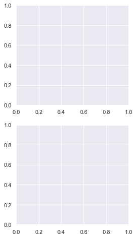
You can set a more general Figure size with the matplotlib figaspect function. It lets you set the aspect ratio (height/width) of the Figure.
Above, I created a Figure twice as long as it is wide by setting figsize=plt.figaspect(2).
Note: Remember the aspect ratio (height/width) formula by recalling that height comes first in the alphabet.
Now let’s look at putting different sized Subplots on one Figure.
Matplotlib Subplots Different Sizes
The hardest part of creating a Figure with different sized Subplots in matplotlib is figuring out what fraction each Subplot takes up.
So, you should know what you are aiming for before you start. You could sketch it on paper or draw shapes in PowerPoint. Once you’ve done this, everything else is much easier.
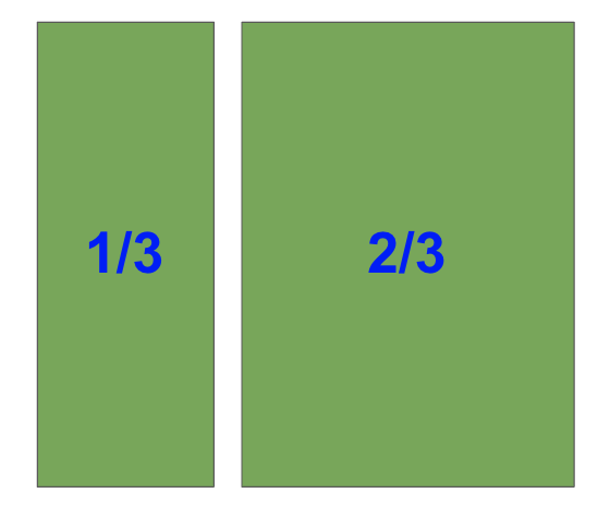
I’m going to create this shape
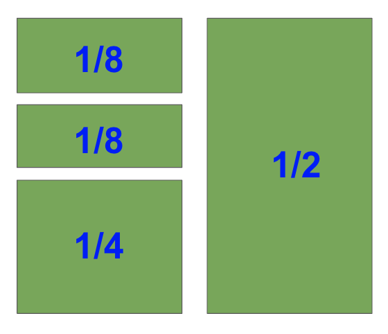
I’ve labeled the fraction each Subplot takes up as we need this for our plt.subplot() calls.
I’ll create the biggest subplot first and the others in descending order.
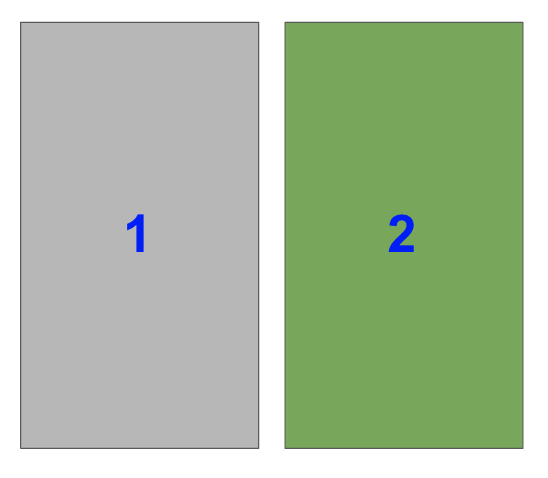
The right-hand side is half of the plot. It is one of two plots on a Figure with 1 row and 2 columns. To select it with plt.subplot(), you need to set index=2.
Note that in the image, the blue numbers are the index values each Subplot has.
In code, this is
plt.subplot(122)
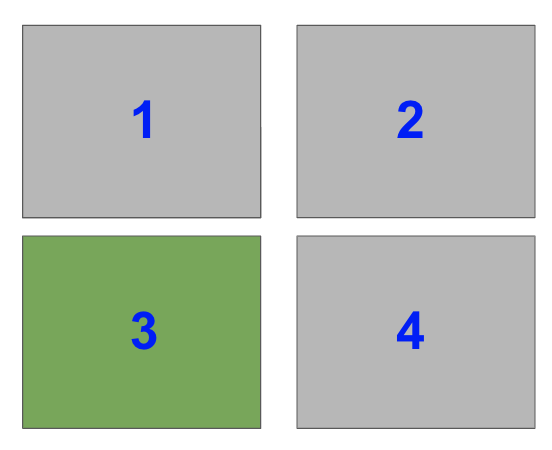
Now, select the bottom left Subplot in a a 2×2 grid i.e. index=3
plt.subplot(223)
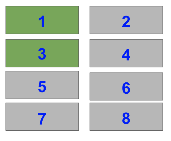
Lastly, select the top two Subplots on the left-hand side of a 4×2 grid i.e. index=1 and index=3.
plt.subplot(421)

plt.subplot(423)
When you put this altogether you get
# Subplots you have just figured out

plt.subplot(122)

plt.subplot(223)

plt.subplot(421)

plt.subplot(423) plt.tight_layout(pad=0.1)

plt.show()

Perfect! Breaking the Subplots down into their individual parts and knowing the shape you want makes everything easier.
Matplotlib Subplot Size Different
You may have noticed that each of the Subplots in the previous example took up 1/x fraction of space – 1/2, 1/4 and 1/8.
With the matplotlib subplot function, you can only create Subplots that are 1/x.
It is not possible to create the above plot in matplotlib using the plt.subplot() function. However, if you use the matplotlib subplots function or GridSpec, then it can be done.
Matplotlib Subplots_Adjust
If you aren’t happy with the spacing between plots that plt.tight_layout() provides, manually adjust it with plt.subplots_adjust().
It takes 6 optional, self-explanatory keyword arguments. Each accepts a float in the range [0.0, 1.0] and they are a fraction of the font size:
left,right,bottomandtopis the spacing on each side of theSubplotwspace– the width betweenSubplotshspace– the height betweenSubplots
# Same grid as above

plt.subplot(122)

plt.subplot(223)

plt.subplot(421)

plt.subplot(423) # Set horizontal and vertical space to 0.05

plt.subplots_adjust(hspace=0.05, wspace=0.05)

plt.show()
In this example, I decreased both the height and width to just 0.05. Now there is hardly any space between the plots.
To avoid loads of similar examples, play around with the arguments yourself to get a feel for how this function works.
Matplotlib Suplot DPI
The Dots Per Inch (DPI) is a measure of printer resolution. It is the number of colored dots placed on each square inch of paper when it’s printed. The more dots you have, the higher the quality of the image. If you are going to print your plot on a large poster, it’s a good idea to use a large DPI.
The DPI for each Figure is controlled by the plt.rcParams dictionary. It contains all the runtime configuration settings. If you print plt.rcParams to the screen, you will see all the variables you can modify. We want figure.dpi.
Let’s make a simple line plot first with the default DPI (72.0) and then a much smaller value.
# Print default DPI

print(f"The default DPI in matplotlib is {plt.rcParams['figure.dpi']}") # Default DPI

plt.plot([1, 2, 3, 4])

plt.title('DPI - 72.0')

plt.show() # Smaller DPI

plt.rcParams['figure.dpi'] = 30.0

plt.plot([1, 2, 3, 4])

plt.title('DPI - 30.0')

plt.show() # Change DPI back to 72.0

plt.rcParams['figure.dpi'] = 72.0
The default DPI in matplotlib is 72.0
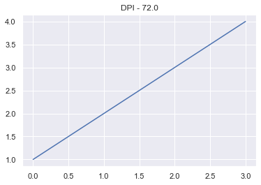
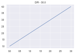
The Figure with a smaller DPI is smaller and has a lower resolution.
If you want to permanently change the DPI of all matplotlib Figures – or any of the runtime configuration settings – find the matplotlibrc file on your system and modify it.
You can find it by entering
import matplotlib as mpl

mpl.matplotlib_fname()
Once you have found it, there are notes inside telling you what everything does.
Matplotlib Subplot Spacing
The function plt.tight_layout() solves most of your spacing issues. If that is not enough, call it with the optional pad and pass a float in the range [0.0, 1.0]. If that still is not enough, use the plt.subplots_adjust() function.
I’ve explained both of these functions in detail further up the article.
Matplotlib Subplot Colorbar
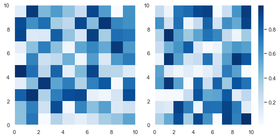
Adding a colorbar to each plot is the same as adding a title – code it underneath the plt.subplot() call you are currently working on. Let’s plot a 1×2 grid where each Subplot is a heatmap of randomly generated numbers.
For more info on the Python random module, check out my article. I use the Numpy random module below but the same ideas apply.
# Set seed so you can reproduce results

np.random.seed(1) # Create a 10x10 array of random floats in the range [0.0, 1.0]

data1 = np.random.random((10, 10))

data2 = np.random.random((10, 10)) # Make figure twice as wide as it is long plt.figure(figsize=plt.figaspect(1/2)) # First subplot

plt.subplot(121)

pcm1 = plt.pcolormesh(data1, cmap='Blues')

plt.colorbar(pcm1) # Second subplot

plt.subplot(122)

pcm2 = plt.pcolormesh(data2, cmap='Greens')

plt.colorbar(pcm2) plt.tight_layout()

plt.show()
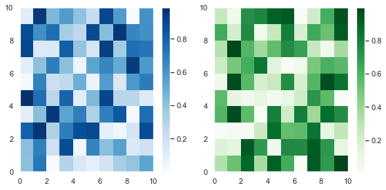
First, I created some (10, 10) arrays containing random numbers between 0 and 1 using the np.random.random() function. Then I plotted them as heatmaps using plt.pcolormesh(). I stored the result and passed it to plt.colorbar(), then finished the plot.
As this is an article on Subplots, I won’t discuss the matplotlib pcolormesh function in detail.
Since these plots are different samples of the same data, you can plot them with the same color and just draw one colorbar.
To draw this plot, use the same code as above and set the same colormap in both matplotlib pcolormesh calls – cmap='Blues'. Then draw the colorbar on the second subplot.
This doesn’t look as good as the above Figure since the colorbar takes up space from the second Subplot. Unfortunately, you cannot change this behavior – the colorbar takes up space from the Subplot it is drawn next to.
It is possible to draw colorbars over multiple Subplots but you need to use the plt.subplots() function. I’ve written a whole tutorial on this—so feel free to check out this more powerful function!
Matplotlib Subplot Grid
A Grid is the number of rows and columns you specify when calling plt.subplot(). Each section of the Grid is called a cell. You can create any sized grid you want. But plt.subplot() only creates Subplots that span one cell. To create Subplots that span multiple cells, use the GridSpec class, the plt.subplots() function or the subplot2grid method.
I discuss these in detail in my article on matplotlib subplots.
Summary
Now you know everything there is to know about the subplot function in matplotlib.
You can create grids of any size you want and draw subplots of any size – as long as it takes up 1/xth of the plot. If you want a larger or smaller Figure you can change it with the plt.figure() function. Plus you can control the DPI, spacing and set the title.
Armed with this knowlege, you can now make impressive plots of unlimited complexity.
But you have also discovered some of the limits of the subplot function. And you may feel that it is a bit clunky to type plt.subplot() whenever you want to draw a new one.
To learn how to create more detailed plots with less lines of code, read my article on the plt.subplots() (with an ‘s’) function.
Where To Go From Here?
Do you wish you could be a programmer full-time but don’t know how to start?
Check out my pure value-packed webinar where I teach you to become a Python freelancer in 60 days or your money back!
https://tinyurl.com/become-a-python-freelancer
It doesn’t matter if you’re a Python novice or Python pro. If you are not making six figures/year with Python right now, you will learn something from this webinar.
These are proven, no-BS methods that get you results fast.
This webinar won’t be online forever. Click the link below before the seats fill up and learn how to become a Python freelancer, guaranteed.
https://tinyurl.com/become-a-python-freelancer
WordPress conversion from plt.subplot.ipynb by nb2wp v0.3.1
https://www.sickgaming.net/blog/2020/02/...ted-guide/