


Are you tired with the same old 2D plots? Do you want to take your plots to the next level? Well look no further, it’s time to learn how to make 3D plots in matplotlib.
In addition to import matplotlib.pyplot as plt and calling plt.show(), to create a 3D plot in matplotlib, you need to:
- Import the
Axes3Dobject - Initialize your
FigureandAxes3Dobjects - Get some 3D data
- Plot it using
Axesnotation and standard function calls
# Standard import
import matplotlib.pyplot as plt # Import 3D Axes from mpl_toolkits.mplot3d import axes3d # Set up Figure and 3D Axes fig = plt.figure()
ax = fig.add_subplot(111, projection='3d') # Get some 3D data
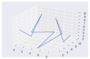
X = [0, 1, 2, 3, 4, 5, 6, 7, 8, 9]
Y = [2, 5, 8, 2, 10, 1, 10, 5, 7, 8]
Z = [6, 3, 9, 6, 3, 2, 3, 10, 2, 4] # Plot using Axes notation and standard function calls
ax.plot(X, Y, Z)
plt.show()
Awesome! You’ve just created your first 3D plot! Don’t worry if that was a bit fast, let’s dive into a more detailed example.
Try it yourself with our interactive Python shell. Just execute the code and look at the generated “plot.png” file:
Related article:
Matplotlib 3D Plot Example
If you are used to plotting with Figure and Axes notation, making 3D plots in matplotlib is almost identical to creating 2D ones. If you are not comfortable with Figure and Axes plotting notation, check out this article to help you.
Besides the standard import matplotlib.pyplot as plt, you must alsofrom mpl_toolkits.mplot3d import axes3d. This imports a 3D Axes object on which a) you can plot 3D data and b) you will make all your plot calls with respect to.
You set up your Figure in the standard way
fig = plt.figure()
And add a subplots to that figure using the standard fig.add_subplot() method. If you just want a single Axes, pass 111 to indicate it’s 1 row, 1 column and you are selecting the 1st one. Then you need to pass projection='3d' which tells matplotlib it is a 3D plot.
From now on everything is (almost) the same as 2D plotting. All the functions you know and love such as ax.plot() and ax.scatter() accept the same keyword arguments but they now also accept three positional arguments – X,Y and Z.
In some ways 3D plots are more natural for us to work with since we live in a 3D world. On the other hand, they are more complicated since we are so used to 2D plots. One amazing feature of Jupyter Notebooks is the magic command %matplotlib notebook which, if ran at the top of your notebook, draws all your plots in an interactive window. You can change the orientation by clicking and dragging (right click and drag to zoom in) which can really help to understand your data.
As this is a static blog post, all of my plots will be static but I encourage you to play around in your own Jupyter or IPython environment.
Related article:
Matplotlib 3D Plot Line Plot
Here’s an example of the power of 3D line plots utilizing all the info above.
# Standard imports
import matplotlib.pyplot as plt
import numpy as np # Import 3D Axes from mpl_toolkits.mplot3d import axes3d # Set up Figure and 3D Axes fig = plt.figure()
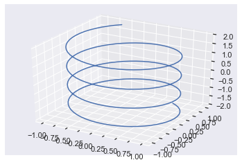
ax = fig.add_subplot(111, projection='3d') # Create space of numbers for cos and sin to be applied to
theta = np.linspace(-12, 12, 200)
x = np.sin(theta)
y = np.cos(theta) # Create z space the same size as theta z = np.linspace(-2, 2, 200) ax.plot(x, y, z)
plt.show()
To avoid repetition, I won’t explain the points I have already made above about imports and setting up the Figure and Axes objects.
I created the variable theta using np.linspace which returns an array of 200 numbers between -12 and 12 that are equally spaced out i.e. there is a linear distance between them all. I passed this to np.sin() and np.cos() and saved them in variables x and y.
If you just plotted x and y now, you would get a circle. To get some up/down movement, you need to modify the z-axis. So, I used np.linspace again to create a list of 200 numbers equally spaced out between -2 and 2 which can be seen by looking at the z-axis (the vertical one).
Note: if you choose a smaller number of values for np.linspace the plot is not as smooth.
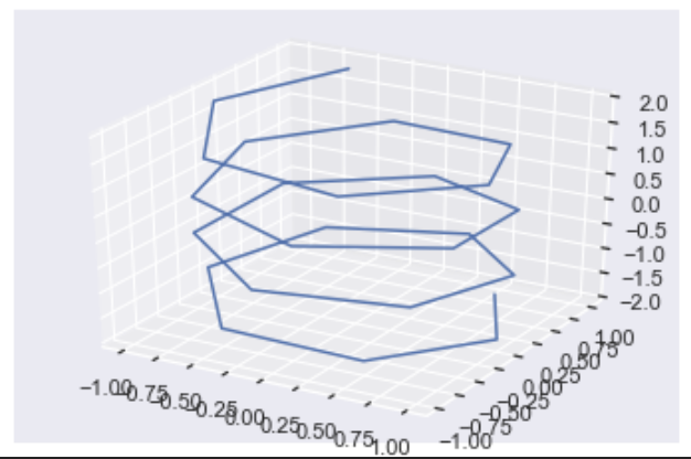
For this plot, I set the third argument of np.linspace to 25 instead of 200. Clearly, this plot is much less smooth than the original and hopefully gives you an understanding of what is happening under the hood with these plots. 3D plots can seem daunting at first so my best advice is to go through the code line by line.
Matplotlib 3D Plot Scatter
Creating a scatter plot is exactly the same as making a line plot but you call ax.scatter instead.
Here’s a cool plot that I adapted from this video. If you sample a normal distribution and create a 3D plot from it, you get a ball of points with the majority focused around the center and less and less the further from the center you go.
import random

random.seed(1) # Create 3 samples from normal distribution with mean and standard deviation of 1

x = [random.normalvariate(1, 1) for _ in range(400)]

y = [random.normalvariate(1, 1) for _ in range(400)]

z = [random.normalvariate(1, 1) for _ in range(400)] # Set up Figure and Axes

fig = plt.figure()

ax = fig.add_subplot(111, projection='3d') # Plot

ax.scatter(x, y, z)

plt.show()
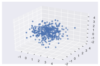
First, I imported the python random module and set the seed so that you can reproduce my results. Next, I used three list comprehensions to create 3 x 400 samples of a normal distribution using the random.normalvariate() function. Then I set up the Figure and Axes as normal and made my plot by calling ax.scatter().
fig = plt.figure()

ax = fig.add_subplot(111, projection='3d')

ax.scatter(X, Y, Z)

plt.show()
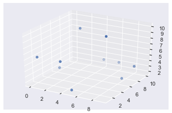
In this example, I plotted the same X, Y and Z lists as in the very first example. I want to highlight to you that some of the points are darker and some are more transparent – this indicates depth. The ones that are darker in color are in the foreground and those further back are more see-through.
If you plot this in IPython or an interactive Jupyter Notebook window and you rotate the plot, you will see that the transparency of each point changes as you rotate.
Matplotlib 3D Plot Rotate
The easiest way to rotate 3D plots is to have them appear in an interactive window by using the Jupyter magic command %matplotlib notebook or using IPython (which always displays plots in interactive windows). This lets you manually rotate them by clicking and dragging. If you right-click and move the mouse, you will zoom in and out of the plot. To save a static version of the plot, click the save icon.
It is possible to rotate plots and even create animations via code but that is out of the scope of this article.
Matplotlib 3D Plot Axis Labels
Setting axis labels for 3D plots is identical for 2D plots except now there is a third axis – the z-axis – you can label.
You have 2 options:
- Use the
ax.set_xlabel(),ax.set_ylabel()andax.set_zlabel()methods, or - Use the
ax.set()method and pass it the keyword argumentsxlabel,ylabelandzlabel.
Here is an example using the first method.
fig = plt.figure()

ax = fig.add_subplot(111, projection='3d')

ax.scatter(X, Y, Z) # Method 1

ax.set_xlabel('X axis')

ax.set_ylabel('Y axis')

ax.set_zlabel('Z axis') plt.show()
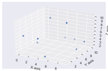
Now each axis is labeled as expected.
You may notice that the axis labels are not particularly visible using the default settings. You can solve this by manually increasing the size of the Figure with the figsize argument in your plt.figure() call.
One thing I don’t like about method 1 is that it takes up 3 lines of code and they are boring to type. So, I much prefer method 2.
# Set Figure to be 8 inches wide and 6 inches tall

fig = plt.figure(figsize=(8, 6))

ax = fig.add_subplot(111, projection='3d')

ax.scatter(X, Y, Z) # Method 2 - set all labels in one line of code!

ax.set(xlabel='X axis', ylabel='Y axis', zlabel='Z axis') plt.show()
Much better! Firstly, because you increased the size of the Figure, all the axis labels are clearly visible. Plus, it only took you one line of code to label them all. In general, if you ever use a ax.set_<something>() method in matplotlib, it can be written as ax.set(<something>=) instead. This saves you space and is nicer to type, especially if you want to make numerous modifications to the graph such as also adding a title.
Matplotlib 3D Plot Legend
You add legends to 3D plots in the exact same way you add legends to any other plots. Use the label keyword argument and then call ax.legend() at the end.
import random random.seed(1)

fig = plt.figure()

ax = fig.add_subplot(111, projection='3d') # Plot and label original data

ax.scatter(X, Y, Z, label='First Plot') # Randomly re-order the data

for data in [X, Y, Z]: random.shuffle(data) # Plot and label re-ordered data

ax.scatter(X, Y, Z, label='Second Plot') ax.legend(loc='upper left')

plt.show()
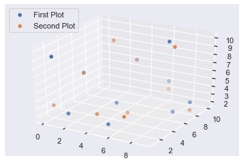
In this example, I first set the random seed to 1 so that you can reproduce the same results as me. I set up the Figure and Axes as expected, made my first 3D plot using X, Y and Z and labeled it with the label keyword argument and an appropriate string.
To save me from manually creating a brand new dataset, I thought it would be a good idea to make use of the data I already had. So, I applied the random.shuffle() function to each of X, Y and Z which mixes the values of the lists in place. So, calling ax.plot() the second time, plotted the same numbers but in a different order, thus producing a different looking plot. Finally, I labeled the second plot and called ax.legend(loc='upper left') to display a legend in the upper left corner of the plot.
All the usual things you can do with legends are still possible for 3D plots. If you want to learn more than these basic steps, check out my comprehensive guide to legends in matplotlib.
Note: If you run the above code again, you will get a different looking plot. This is because you will start with the shuffled X, Y and Z lists rather than the originals you created further up inb the post.
Matplotlib 3D Plot Background Color
There are two backgrounds you can modify in matplotlib – the Figure and the Axes background. Both can be set using either the .set_facecolor('color') or the .set(facecolor='color') methods. Hopefully, you know by now that I much prefer the second method over the first!
Here’s an example where I set the Figure background color to green and the Axes background color to red.
fig = plt.figure(figsize=(8, 6))

ax = fig.add_subplot(111, projection='3d')

ax.plot(X, Y, Z) # Axes color is red

ax.set(facecolor='r')

# Figure color is green

fig.set(facecolor='g')

plt.show()
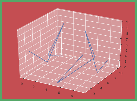
The first three lines are the same as a simple line plot. Then I called ax.set(facecolor='r') to set the Axes color to red and fig.set(facecolor='g') to set the Figure color to green.
In an example with one Axes, it looks a bit odd to set the Figure and Axes colors separately. If you have more than one Axes object, it looks much better.
# Set up Figure and Axes in one function call

fig, axes = plt.subplots(nrows=2, ncols=2, figsize=(8, 6), subplot_kw=dict(projection='3d')) colors = ['r', 'g', 'y', 'b'] # iterate over colors and all Axes objects

for c, ax in zip(colors, axes.flat): ax.plot(X, Y, Z) # Set Axes color ax.set(facecolor=c) # Set Figure color

fig.set(facecolor='pink')

plt.show()
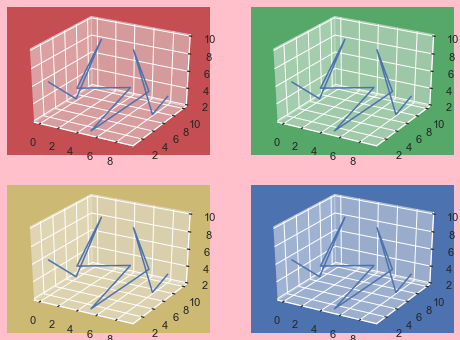
In this example, I used plt.subplots() to set up an 8×6 inch Figure containing four 3D Axes objects in a 2×2 grid. The subplot_kw argument accepts a dictionary of values and these are passed to add_subplot to make each Axes object. For more info on using plt.subplots() check out my article.
Then I created the list colors containing 4 matplotlib color strings. After that, I used a for loop to iterate over colors and axes.flat. In order to iterate over colors and axes together, they need to be the same shape. There are several ways to do this but using the .flat attribute works well in this case.
Finally, I made the same plot on each Axes and set the facecolors. It is clear now why setting a Figure color can be more useful if you create subplots – there is more space for the color to shine through.
Conclusion
That’s it, you now know the basics of creating 3D plots in matplotlib!
You’ve learned the necessary imports you need and also how to set up your Figure and Axes objects to be 3D. You’ve looked at examples of line and scatter plots. Plus, you can modify these by rotating them, adding axis labels, adding legends and changing the background color.
There is still more to be learned about 3D plots such as surface plots, wireframe plots, animating them and changing the aspect ratio but I’ll leave those for another article.
Where To Go From Here?
Do you wish you could be a programmer full-time but don’t know how to start?
Check out the pure value-packed webinar where Chris – creator of Finxter.com – teaches you to become a Python freelancer in 60 days or your money back!
https://tinyurl.com/become-a-python-freelancer
It doesn’t matter if you’re a Python novice or Python pro. If you are not making six figures/year with Python right now, you will learn something from this webinar.
These are proven, no-BS methods that get you results fast.
This webinar won’t be online forever. Click the link below before the seats fill up and learn how to become a Python freelancer, guaranteed.
https://www.sickgaming.net/blog/2020/04/...ted-guide/