


And we’re back with another edition of Box Art Brawl, your weekly opportunity to peruse covers of video games past and pick your favourite.
Last week we checked out Super C, although Super C didn’t actually win the vote. Nope, it was the European Probotectors who took the title with a small but significant (and surprising) margin over North America’s Billy and Lance. Who would have thought a couple of robots could take the crown from the Contra legends?
This week we’re looking at one of gaming’s most infamous box art images, at least in the West. The story behind the off-kilter North American cover is an interesting one (far more interesting than the game inside the box) and it has gone down as one of the most notoriously covers in video gaming history. It’s got a high WTF-factor, but we’ve seen far worse and the ‘banjo man’ cover certainly grabs your attention.
But should that be a factor in your voting? That, my friends, is up to you…
Japan
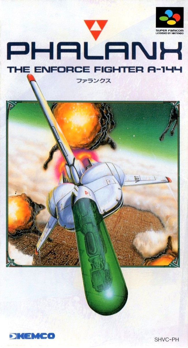
We begin in Japan. A ship (which resembles an Imperial Shuttle with a giant transparent green phallus bolted on the front) flies over a city revealed through an otherwise cloud-covered planet surface. Billowing orb-like explosions fill the air and the top fin and cockpit (careful with your emphasis, there) break the border of the square image, bursting out into the white/blue of the long Super Famicom box.
The logo is understated and effective, there’s an upside-down red Triforce, and the Super Famicom and Kemco logos are both classily subtle. It’s a shame that the game is a bit rubbish, but we don’t dislike this cover.
Europe

Europe uses the same key art as Japan, although the contrast has been blown out and the colours muted. We get a wider view of the planet below and more explosions are visible. The logo is a little generic, and there’s a lot of black space in the border here which might have been put to better use.
Not awful, but a better job could have been made using the same components.
North America
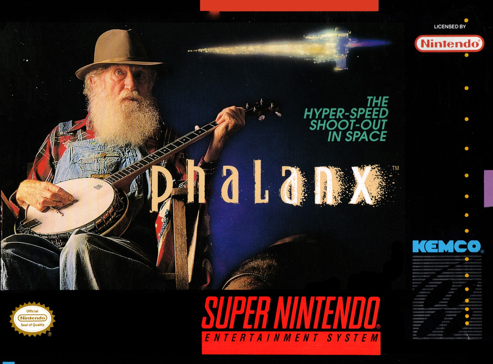
Ah, banjo guy. In order to indicate what the game actually is, the infamous North American cover gains a tagline: “THE HYPER-SPEED SHOOT-OUT IN SPACE”. There’s also a small ship added above the tag, although it’s difficult to tell if it’s flying towards or away from the old bearded banjo player.
The juxtaposition here draws your attention, and we also like the logo on this one, with the letters gradually shedding their pigment as ‘dust’, or something, as you move along the word to the ‘X’ (and the tiny trademark symbol).
As box art goes, it’s a difficult one to evaluate. In many respects, it’s incredibly successful at what it does. How many of us would never have heard of Phalanx were it not for this cover? In terms of capturing attention on store shelves, it did very well.
Many believe that great box art should communicate something about how the game plays to the viewer. We’re not sure we agree, but we’re not the ones voting – that’s in your hands, dear reader!
Banjo dude or phallic gunship? That’s your choice this week. Click your favourite cover and hit the ‘Vote’ button to let us know your pick below:
And so ends the 45th round of the boxiest of art-based brawls. We’ll see you next week for Round #46.
https://www.sickgaming.net/blog/2020/05/...5-phalanx/