Create an account


Thread Rating:
  • 0 Vote(s) - 0 Average
  • 1
  • 2
  • 3
  • 4
  • 5
News - Random: Burnout’s Switch Home Menu Icon Needs To Drop The Border

#1
Random: Burnout’s Switch Home Menu Icon Needs To Drop The Border

<div><div class="media_block"><a href="http://images.nintendolife.com/c88c4e68bb445/large.jpg"><img src="http://images.nintendolife.com/c88c4e68bb445/small.jpg" class="media_thumbnail"></a></div>
<figure class="picture strip"><a title="Burnout Paradise" href="http://images.nintendolife.com/c88c4e68bb445/burnout-paradise.original.jpg"><img src="http://images.nintendolife.com/c88c4e68bb445/burnout-paradise.900x.jpg" width="900" height="506" alt="Burnout Paradise"></a></figure>
<p>
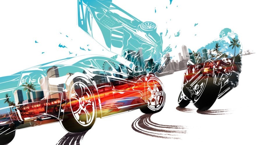
Criterion Games’ fantastic open-world racing game <strong><a href="http://www.nintendolife.com/games/nintendo-switch/burnout_paradise_remastered">Burnout Paradise Remastered</a></strong> is now available on the Nintendo Switch.</p>
<p>Let’s just make this clear – despite the price being a “<a href="http://www.nintendolife.com/reviews/nintendo-switch/burnout_paradise_remastered">car crash</a>” it’s still an outrageously fast and fun experience that we would highly recommend checking out if you haven’t already.</p>
<p>All that aside, though, there appears to be trouble in paradise. A user over on the Nintendo Switch subreddit has noticed how the HOME Menu icon for Burnout has a border around it, and well…they’re not particularly happy:</p>
<blockquote>
<p>I did not wanted to join the EA hate-train. And I was excited to get Burnout on the Switch ignoring the price tag. (edit: and I still am) But well … it seems like EA really doesnt care about the Switch.</p>
<p>The icon for Burnout Paradise is not scaled properly and the grid of the graphic software(!) is still visible as a border around the actual icon now.</p>
<p>I am assuming EA is already aware of it and it is gonna be fixed by a day one patch. At least that is my hope. They are a highly professional company after all.</p>
</blockquote>
<blockquote>
<p>I know most people dont care. But for me a good icon is important. Especially on a pricey title like this. And since the Switch homescreen is all about the icons.</p>
<p>It just makes me very sad that nobody checked twice.</p>
</blockquote>
<p>We took a screenshot of this icon on our own Switch menu:</p>
<figure class="picture strip">
<div class="img"><a title="Burnout Paradise Remastered Icon - Nintendo Life IMG" href="http://images.nintendolife.com/bda8532c17b54/burnout-paradise-remastered-icon-nintendo-life-img.original.jpg"><img class="lazy" src="//www.w3.org/2000/svg' viewBox='0 0 900 506'%3E%3C/svg%3E" width="900" height="506" data-original="http://images.nintendolife.com/bda8532c17b54/burnout-paradise-remastered-icon-nintendo-life-img.900x.jpg" alt="Burnout Paradise Remastered Icon - Nintendo Life IMG"></a><span class="image-credit" title="Image Credit">Nintendo Life</span></div>
</figure>
<p>And here’s a close-up, if you still can’t see it:</p>
<figure class="picture strip"></figure>
<p>While we can understand how some players might find a border around an icon a little irritating, <em>it’s not the end of the world</em>. It’s also something that can be easily updated in the future. <a href="http://www.nintendolife.com/news/2017/07/random_internet_reacts_badly_to_the_new_snake_pass_menu_icon">And hey, it could be worse.</a></p>
<p>Did you notice the border around this particular icon? How are you finding this remaster so far? <em>Tell us below.</em></p>
</div>


https://www.sickgaming.net/blog/2020/06/...he-border/
Reply


Forum Jump:


Users browsing this thread:
1 Guest(s)

Forum software by © MyBB Theme © iAndrew 2016