


Scatter plots are a key tool in any Data Analyst’s arsenal. If you want to see the relationship between two variables, you are usually going to make a scatter plot.
In this article, you’ll learn the basic and intermediate concepts to create stunning matplotlib scatter plots.
Matplotlib Scatter Plot Example
Let’s imagine you work in a restaurant. You get paid a small wage and so make most of your money through tips. You want to make as much money as possible and so want to maximize the amount of tips. In the last month, you waited 244 tables and collected data about them all.
We’re going to explore this data using scatter plots. We want to see if there are any relationships between the variables. If there are, we can use them to earn more in future.
- Note: this dataset comes built-in as part of the
seabornlibrary.
First, let’s import the modules we’ll be using and load the dataset.
import matplotlib.pyplot as plt

import seaborn as sns # Optional step

# Seaborn's default settings look much nicer than matplotlib

sns.set() tips_df = sns.load_dataset('tips') total_bill = tips_df.total_bill.to_numpy()

tip = tips_df.tip.to_numpy()
The variable tips_df is a pandas DataFrame. Don’t worry if you don’t understand what this is just yet. The variables total_bill and tip are both NumPy arrays.
Let’s make a scatter plot of total_bill against tip. It’s very easy to do in matplotlib – use the plt.scatter() function. First, we pass the x-axis variable, then the y-axis one. We call the former the independent variable and the latter the dependent variable. A scatter graph shows what happens to the dependent variable (y) when we change the independent variable (x).
plt.scatter(total_bill, tip)

plt.show()

Nice! It looks like there is a positive correlation between a total_bill and tip. This means that as the bill increases, so does the tip. So we should try and get our customers to spend as much as possible.
Matplotlib Scatter Plot with Labels
Labels are the text on the axes. They tell us more about the plot and is it essential you include them on every plot you make.
Let’s add some axis labels and a title to make our scatter plot easier to understand.
plt.scatter(total_bill, tip)

plt.title('Total Bill vs Tip')

plt.xlabel('Total Bill ($)')

plt.ylabel('Tip ($)')

plt.show()

Much better. To save space, we won’t include the label or title code from now on, but make sure you do.
This looks nice but the markers are quite large. It’s hard to see the relationship in the $10-$30 total bill range.
We can fix this by changing the marker size.
Matplotlib Scatter Marker Size
The s keyword argument controls the size of markers in plt.scatter(). It accepts a scalar or an array.
Matplotlib Scatter Marker Size – Scalar
In plt.scatter(), the default marker size is s=72.
The docs define s as:
The marker size in points**2.
This means that if we want a marker to have area 5, we must write s=5**2.
The other matplotlib functions do not define marker size in this way. For most of them, if you want markers with area 5, you write s=5. We’re not sure why plt.scatter() defines this differently.
One way to remember this syntax is that graphs are made up of square regions. Markers color certain areas of those regions. To get the area of a square region, we do length**2. For more info, check out this Stack Overflow answer.
To set the best marker size for a scatter plot, draw it a few times with different s values.
# Small s

plt.scatter(total_bill, tip, s=1)

plt.show()
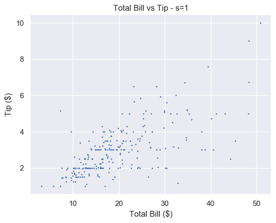
A small number makes each marker small. Setting s=1 is too small for this plot and makes it hard to read. For some plots with a lot of data, setting s to a very small number makes it much easier to read.
# Big s

plt.scatter(total_bill, tip, s=100)

plt.show()

Alternatively, a large number makes the markers bigger. This is too big for our plot and obscures a lot of the data.
We think that s=20 strikes a nice balance for this particular plot.
# Just right

plt.scatter(total_bill, tip, s=20)

plt.show()
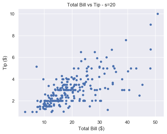
There is still some overlap between points but it is easier to spot. And unlike for s=1, you don’t have to strain to see the different markers.
Matplotlib Scatter Marker Size – Array
If we pass an array to s, we set the size of each point individually. This is incredibly useful let’s use show more data on our scatter plot. We can use it to modify the size of our markers based on another variable.
You also recorded the size of each of table you waited. This is stored in the NumPy array size_of_table. It contains integers in the range 1-6, representing the number of people you served.
# Select column 'size' and turn into a numpy array

size_of_table = tips_df['size'].to_numpy() # Increase marker size to make plot easier to read

size_of_table_scaled = [3*s**2 for s in size_of_table] plt.scatter(total_bill, tip, s=size_of_table_scaled)

plt.show()
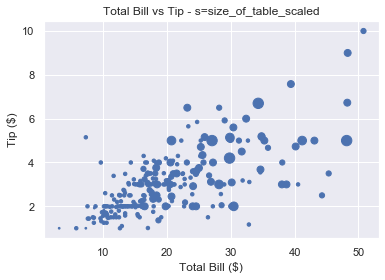
Not only does the tip increase when total bill increases, but serving more people leads to a bigger tip as well. This is in line with what we’d expect and it’s great our data fits our assumptions.
Why did we scale the size_of_table values before passing it to s? Because the change in size isn’t visible if we set s=1, …, s=6 as shown below.

So we first square each value and multiply it by 3 to make the size difference more pronounced.
We should label everything on our graphs, so let’s add a legend.
Matplotlib Scatter Legend
To add a legend we use the plt.legend() function. This is easy to use with line plots. If we draw multiple lines on one graph, we label them individually using the label keyword. Then, when we call plt.legend(), matplotlib draws a legend with an entry for each line.
But we have a problem. We’ve only got one set of data here. We cannot label the points individually using the label keyword.
How do we solve this problem?
We could create 6 different datasets, plot them on top of each other and give each a different size and label. But this is time-consuming and not scalable.
Fortunately, matplotlib has a scatter plot method we can use. It’s called the legend_elements() method because we want to label the different elements in our scatter plot.
The elements in this scatter plot are different sizes. We have 6 different sized points to represent the 6 different sized tables. So we want legend_elements() to split our plot into 6 sections that we can label on our legend.
Let’s figure out how legend_elements() works. First, what happens when we call it without any arguments?
# legend_elements() is a method so we must name our scatter plot

scatter = plt.scatter(total_bill, tip, s=size_of_table_scaled) legend = scatter.legend_elements() print(legend)

# ([], [])
Calling legend_elements() without any parameters, returns a tuple of length 2. It contains two empty lists.
The docs tell us legend_elements() returns the tuple (handles, labels). Handles are the parts of the plot you want to label. Labels are the names that will appear in the legend. For our plot, the handles are the different sized markers and the labels are the numbers 1-6. The plt.legend() function accepts 2 arguments: handles and labels.
The plt.legend() function accepts two arguments: plt.legend(handles, labels). As scatter.legend_elements() is a tuple of length 2, we have two options. We can either use the asterisk * operator to unpack it or we can unpack it ourselves.
# Method 1 - unpack tuple using *

legend = scatter.legend_elements()

plt.legend(*legend) # Method 2 - unpack tuple into 2 variables

handles, labels = scatter.legend_elements()

plt.legend(handles, labels)
Both produce the same result. The matplotlib docs use method 1. Yet method 2 gives us more flexibility. If we don’t like the labels matplotlib creates, we can overwrite them ourselves (as we will see in a moment).
Currently, handles and labels are empty lists. Let’s change this by passing some arguments to legend_elements().
There are 4 optional arguments but let’s focus on the most important one: prop.
Prop – the property of the scatter graph you want to highlight in your legend. Default is 'colors', the other option is 'sizes'.
We will look at different colored scatter plots in the next section. As our plot contains 6 different sized markers, we set prop='sizes'.
scatter = plt.scatter(total_bill, tip, s=size_of_table_scaled) handles, labels = scatter.legend_elements(prop='sizes')
Now let’s look at the contents of handles and labels.
>>> type(handles)

list

>>> len(handles)

6 >>> handles

[<matplotlib.lines.Line2D object at 0x1a2336c650>,

<matplotlib.lines.Line2D object at 0x1a2336bd90>,

<matplotlib.lines.Line2D object at 0x1a2336cbd0>,

<matplotlib.lines.Line2D object at 0x1a2336cc90>,

<matplotlib.lines.Line2D object at 0x1a2336ce50>,

<matplotlib.lines.Line2D object at 0x1a230e1150>]
Handles is a list of length 6. Each element in the list is a matplotlib.lines.Line2D object. You don’t need to understand exactly what that is. Just know that if you pass these objects to plt.legend(), matplotlib renders an appropriate 'picture'. For colored lines, it’s a short line of that color. In this case, it’s a single point and each of the 6 points will be a different size.
It is possible to create custom handles but this is out of the scope of this article. Now let’s look at labels.
>>> type(labels)

list

>>> len(labels)

6 >>> labels

['$\\mathdefault{3}$', '$\\mathdefault{12}$', '$\\mathdefault{27}$', '$\\mathdefault{48}$', '$\\mathdefault{75}$', '$\\mathdefault{108}$']
Again, we have a list of length 6. Each element is a string. Each string is written using LaTeX notation '$...$'. So the labels are the numbers 3, 12, 27, 48, 75 and 108.
Why these numbers? Because they are the unique values in the list size_of_table_scaled. This list defines the marker size.
>>> np.unique(size_of_table_scaled)

array([ 3, 12, 27, 48, 75, 108])
We used these numbers because using 1-6 is not enough of a size difference for humans to notice.
However, for our legend, we want to use the numbers 1-6 as this is the actual table size. So let’s overwrite labels.
labels = ['1', '2', '3', '4', '5', '6']
Note that each element must be a string.
We now have everything we need to create a legend. Let’s put this together.
# Increase marker size to make plot easier to read

size_of_table_scaled = [3*s**2 for s in size_of_table] # Scatter plot with marker sizes proportional to table size

scatter = plt.scatter(total_bill, tip, s=size_of_table_scaled) # Generate handles and labels using legend_elements method

handles, labels = scatter.legend_elements(prop='sizes') # Overwrite labels with the numbers 1-6 as strings

labels = ['1', '2', '3', '4', '5', '6'] # Add a title to legend with title keyword

plt.legend(handles, labels, title='Table Size')

plt.show()

Perfect, we have a legend that shows the reader exactly what the graph represents. It is easy to understand and adds a lot of value to the plot.
Now let’s look at another way to represent multiple variables on our scatter plot: color.
Matplotlib Scatter Plot Color
Color is an incredibly important part of plotting. It could be an entire article in itself. Check out the Seaborn docs for a great overview.
Color can make or break your plot. Some color schemes make it ridiculously easy to understand the data. Others make it impossible.
However, one reason to change the color is purely for aesthetics.
We choose the color of points in plt.scatter() with the keyword c or color.
You can set any color you want using an RGB or RGBA tuple (red, green, blue, alpha). Each element of these tuples is a float in [0.0, 1.0]. You can also pass a hex RGB or RGBA string such as '#1f1f1f'. However, most of the time you’ll use one of the 50+ built-in named colors. The most common are:
'b'or'blue''r'or'red''g'or'green''k'or'black''w'or'white'
Here’s the plot of total_bill vs tip using different colors

For each plot, call plt.scatter() with total_bill and tip and set color (or c) to your choice
# Blue (the default value)

plt.scatter(total_bill, tip, color='b') # Red

plt.scatter(total_bill, tip, color='r') # Green

plt.scatter(total_bill, tip, c='g') # Black

plt.scatter(total_bill, tip, c='k')
Note: we put the plots on one figure to save space. We’ll cover how to do this in another article (hint: use plt.subplots())
Matplotlib Scatter Plot Different Colors
Our restaurant has a smoking area. We want to see if a group sitting in the smoking area affects the amount they tip.
We could show this by changing the size of the markers like above. But it doesn’t make much sense to do so. A bigger group logically implies a bigger marker. But marker size and being a smoker don’t have any connection and may be confusing for the reader.
Instead, we will color our markers differently to represent smokers and non-smokers.
We have split our data into four NumPy arrays:
- x-axis – non_smoking_total_bill, smoking_total_bill
- y-axis – non_smoking_tip, smoking_tip
If you draw multiple scatter plots at once, matplotlib colors them differently. This makes it easy to recognize the different datasets.

plt.scatter(non_smoking_total_bill, non_smoking_tip)

plt.scatter(smoking_total_bill, smoking_tip)

plt.show()
This looks great. It’s very easy to tell the orange and blue markers apart. The only problem is that we don’t know which is which. Let’s add a legend.
As we have 2 plt.scatter() calls, we can label each one and then call plt.legend().
# Add label names to each scatter plot

plt.scatter(non_smoking_total_bill, non_smoking_tip, label='Non-smoking')

plt.scatter(smoking_total_bill, smoking_tip, label='Smoking') # Put legend in upper left corner of the plot

plt.legend(loc='upper left')

plt.show()
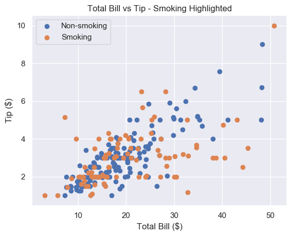
Much better. It seems that the smoker’s data is more spread out and flat than non-smoking data. This implies that smokers tip about the same regardless of their bill size. Let’s try to serve less smoking tables and more non-smoking ones.
This method works fine if we have separate data. But most of the time we don’t and separating it can be tedious.
Thankfully, like with size, we can pass c an array/sequence.
Let’s say we have a list smoker that contains 1 if the table smoked and 0 if they didn’t.
plt.scatter(total_bill, tip, c=smoker)

plt.show()
Note: if we pass an array/sequence, we must the keyword c instead of color. Python raises a ValueError if you use the latter.
ValueError: 'color' kwarg must be an mpl color spec or sequence of color specs.

For a sequence of values to be color-mapped, use the 'c' argument instead.

Great, now we have a plot with two different colors in 2 lines of code. But the colors are hard to see.
Matplotlib Scatter Colormap
A colormap is a range of colors matplotlib uses to shade your plots. We set a colormap with the cmap argument. All possible colormaps are listed here.
We’ll choose 'bwr' which stands for blue-white-red. For two datasets, it chooses just blue and red.
If color theory interests you, we highly recommend this paper. In it, the author creates bwr. Then he argues it should be the default color scheme for all scientific visualizations.
plt.scatter(total_bill, tip, c=smoker, cmap='bwr')

plt.show()

Much better. Now let’s add a legend.
As we have one plt.scatter() call, we must use scatter.legend_elements() like we did earlier. This time, we’ll set prop='colors'. But since this is the default setting, we call legend_elements() without any arguments.
# legend_elements() is a method so we must name our scatter plot

scatter = plt.scatter(total_bill, tip, c=smoker_num, cmap='bwr') # No arguments necessary, default is prop='colors'

handles, labels = scatter.legend_elements() # Print out labels to see which appears first

print(labels)

# ['$\\mathdefault{0}$', '$\\mathdefault{1}$']
We unpack our legend into handles and labels like before. Then we print labels to see the order matplotlib chose. It uses an ascending ordering. So 0 (non-smokers) is first.
Now we overwrite labels with descriptive strings and pass everything to plt.legend().
# Re-name labels to something easier to understand

labels = ['Non-Smokers', 'Smokers'] plt.legend(handles, labels)

plt.show()

This is a great scatter plot. It’s easy to distinguish between the colors and the legend tells us what they mean. As smoking is unhealthy, it’s also nice that this is represented by red as it suggests 'danger'.
What if we wanted to swap the colors?
Do the same as above but make the smoker list 0 for smokers and 1 for non-smokers.
smokers_swapped = [1 - x for x in smokers]
Finally, as 0 comes first, we overwrite labels in the opposite order to before.
labels = ['Smokers', 'Non-Smokers']

Matplotlib Scatter Marker Types
Instead of using color to represent smokers and non-smokers, we could use different marker types.
There are over 30 built-in markers to choose from. Plus you can use any LaTeX expressions and even define your own shapes. We’ll cover the most common built-in types you’ll see. Thankfully, the syntax for choosing them is intuitive.
In our plt.scatter() call, use the marker keyword argument to set the marker type. Usually, the shape of the string reflects the shape of the marker. Or the string is a single letter matching to the first letter of the shape.
Here are the most common examples:
'o'– circle (default)'v'– triangle down'^'– triangle up's'– square'+'– plus'D'– diamond'd'– thin diamond'$...$'– LaTeX syntax e.g.'$\pi$'makes each marker the Greek letter π.
Let’s see some examples

For each plot, call plt.scatter() with total_bill and tip and set marker to your choice
# Circle

plt.scatter(total_bill, tip, marker='o') # Plus

plt.scatter(total_bill, tip, marker='+') # Diamond

plt.scatter(total_bill, tip, marker='D') # Triangle Up

plt.scatter(total_bill, tip, marker='^')
At the time of writing, you cannot pass an array to marker like you can with color or size. There is an open GitHub issue requesting that this feature is added. But for now, to plot two datasets with different markers, you need to do it manually.
# Square marker

plt.scatter(non_smoking_total_bill, non_smoking_tip, marker='s', label='Non-smoking') # Plus marker

plt.scatter(smoking_total_bill, smoking_tip, marker='+', label='Smoking') plt.legend(loc='upper left')

plt.show()
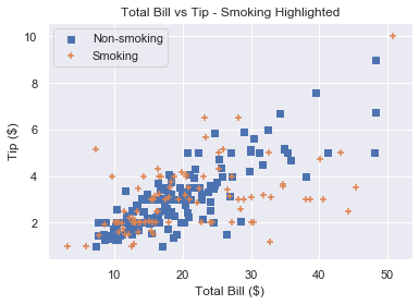
Remember that if you draw multiple scatter plots at once, matplotlib colors them differently. This makes it easy to recognise the different datasets. So there is little value in also changing the marker type.
To get a plot in one color with different marker types, set the same color for each plot and change each marker.
# Square marker, blue color

plt.scatter(non_smoking_total_bill, non_smoking_tip, marker='s', c='b' label='Non-smoking') # Plus marker, blue color

plt.scatter(smoking_total_bill, smoking_tip, marker='+', c='b' label='Smoking') plt.legend(loc='upper left')

plt.show()
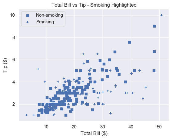
Most would agree that different colors are easier to distinguish than different markers. But now you have the ability to choose.
Summary
You now know the 4 most important things to make excellent scatter plots.
You can make basic matplotlib scatter plots. You can change the marker size to make the data easier to understand. And you can change the marker size based on another variable.
You’ve learned how to choose any color imaginable for your plot. Plus you can change the color based on another variable.
To add personality to your plots, you can use a custom marker type.
Finally, you can do all of this with an accompanying legend (something most Pythonistas don’t know how to use!).
Where To Go From Here
Do you want to earn more money? Are you in a dead-end 9-5 job? Do you dream of breaking free and coding full-time but aren’t sure how to get started?
Becoming a full-time coder is scary. There is so much coding info out there that it’s overwhelming.
Most tutorials teach you Python and tell you to get a full-time job.
That’s ok but why would you want another office job?
Don’t you crave freedom? Don’t you want to travel the world? Don’t you want to spend more time with your friends and family?
There are hardly any tutorials that teach you Python and how to be your own boss. And there are none that teach you how to make six figures a year.
Until now.
We are full-time Python freelancers. We work from anywhere in the world. We set our own schedules and hourly rates. Our calendars are booked out months in advance and we have a constant flow of new clients.
Sounds too good to be true, right?
Not at all. We want to show you the exact steps we used to get here. We want to give you a life of freedom. We want you to be a six-figure coder.
Click the link below to watch our pure-value webinar. We show you the exact steps to take you from where you are to a full-time Python freelancer. These are proven, no-BS methods that get you results fast.
https://tinyurl.com/python-freelancer-webinar
It doesn’t matter if you’re a Python novice or Python pro. If you are not making six figures/year with Python right now, you will learn something from this webinar.
Click the link below now and learn how to become a Python freelancer.
https://tinyurl.com/python-freelancer-webinar
References
- https://stackoverflow.com/questions/14827650/pyplot-scatter-plot-marker-size
- https://matplotlib.org/3.1.1/api/_as_gen/matplotlib.pyplot.scatter.html
- https://seaborn.pydata.org/generated/seaborn.scatterplot.html
- https://matplotlib.org/3.1.1/api/collections_api.html#matplotlib.collections.PathCollection.legend_elements
- https://blog.finxter.com/what-is-asterisk-in-python/
- https://matplotlib.org/3.1.1/api/markers_api.html#module-matplotlib.markers
- https://stackoverflow.com/questions/31726643/how-do-i-get-multiple-subplots-in-matplotlib
- https://matplotlib.org/3.1.0/gallery/color/named_colors.html
- https://matplotlib.org/3.1.0/tutorials/colors/colors.html#xkcd-colors
- https://github.com/matplotlib/matplotlib/issues/11155
- https://matplotlib.org/3.1.1/tutorials/colors/colormaps.html
- https://matplotlib.org/3.1.1/api/_as_gen/matplotlib.pyplot.legend.html
- https://matplotlib.org/tutorials/intermediate/legend_guide.html
- https://seaborn.pydata.org/tutorial/color_palettes.html
- https://cfwebprod.sandia.gov/cfdocs/CompResearch/docs/ColorMapsExpanded.pdf
- https://matplotlib.org/3.1.1/api/_as_gen/matplotlib.pyplot.subplots.html
The post Matplotlib Scatter Plot – Simple Illustrated Guide first appeared on Finxter.
https://www.sickgaming.net/blog/2020/11/...ted-guide/