Posted by: xSicKxBot - 11-25-2020, 05:43 AM - Forum: Windows
- No Replies
Making credit flow again in India during the pandemic
When COVID-19 created a massive health crisis across India this year, it also triggered an unprecedented credit freeze. Millions of people were ordered to stay at home for months on-end, so lenders and customers could not meet face-to-face–a traditional prerequisite for doing business.
No meetings meant almost no new loans.
“The lending business came to a standstill to almost zero from April to June as the whole country was under a lockdown,” recalls Gaurav Aggarwal, head of unsecured loans at Paisabazaar.com, India’s largest marketplace for personal lending products.
The worst of the lockdowns appears over, at least for now. But India is far from being out of the pandemic woods and is working hard on two prime tasks–getting on top of the virus and getting its economy going.
To achieve the latter, credit must again flow freely.
Now a six-year-old fintech startup, Paisabazaar.com has stepped up with a new solution. It’s using cloud computing and machine learning to digitally overhaul the processes surrounding personal loan applications and approvals so money that can get to consumers and businesspeople faster.
What used to take anywhere between five days to a week before the pandemic is now being done in less than 24 hours, and in some cases as quickly as five hours.
Applying for a personal bank loan or a credit card in the traditional way can be a drawn-out affair. Either a customer visits a bank, or a bank representative comes to them to verify their identity. Paper application forms are filled out and supporting documents are collected for manually checking.
When the lockdowns were imposed, these physical and in-person processes were broken, and lending more or less stopped.
The time was ripe for disruption and Paisabazaar.com found itself in the right place at the right time.
In August, the startup launched the ‘Paisabazaar Stack’–a solution that enables lending companies, like banks and non-banking financial corporations (NBFCs), to disburse unsecured loans in a presence-less, completely digital manner.
Embracing a culture of innovation
Gaurav Aggarwal, head of unsecured lending business, Paisabazaar.com
The lending process typically consists of four elements–offering the loan seeker the best offer based on their need and eligibility; collecting documents to establish their identity and ability to repay the loan; verifying those documents; and finally, signing the loan agreement and payment terms.
“One of the big realizations that we had that we if we had to change something, it had to be changed from end-to-end,” says Aggarwal.
As the pandemic brought the whole lending industry down to its knees, Paisabazaar.com, which translates into money (paisa) market (bazaar) in Hindi, embarked on its quest to digitize the entire process.
To make it happen, the startup embraced a culture of innovation. A recent study by IDC commissioned by Microsoft identifies this as the synergy between technology, process, data, and people, that allows organizations to drive sustained innovation.
The study looked at organizations that regard a time of crisis as an opportunity for transformation. It found that they are 1.5 times more confident about recovering within six months and growing their revenues compared with their peers. This is clearly the case with Paisabazaar.com.
“We were trying to create this stack for six months before the pandemic hit us. We wanted to create paperless digital programs, but things were not moving because the industry was not ready,” says Mukesh Sharma, Paisabazaar.com’s chief technology officer (CTO.) “But when it (the lockdown) happened, we were the first to launch this digital stack.”
One of the first challenges the startup had to overcome was to improve the loan approval rates. Even before the pandemic, almost 40% of loans were getting rejected on the platform as customers weren’t aware how the lending industry and regulations function. They’d get swayed by marketing gimmicks, and end up submitting multiple loan applications. This had an adverse effect on their credit worthiness and further reduced their chance of approvals.
When Paisabazaar.com’s team studied the data from rejected applications on their platform, they realized they could help customers by guiding them toward other offers, which had a higher chance of approval.
“We kept monitoring our funnels and data on these rejected applications, did detailed retrospection, and spoke to the customers and lenders to find the root cause (of loan rejections). We could clearly see the customers’ pain, especially when they are in dire need for money or a credit card,” says Sharma.
Paisabazaar.com’s machine learning team created a model based on lending data of over 50 partner banks and financial institutions over the last six years.
The chance of approval feature, which gets more intelligent with every loan disbursed through Paisabazaar.com, has helped increase approval rate by nearly 25 percent in the first 12 months (Photo by Amit Verma)
The model, which is built on Microsoft Azure and uses technologies like Azure Kubernetes services, Azure Container Service, and Azure Virtual Machine Scale Sets, matches a borrower’s profile like income, credit score, age, among others, with the various lending criteria of different lenders. It then provides customers with the odds of getting their loan application approved—excellent, good, fair, or poor—against each lender.
The team also looked at how they could digitize the “Know Your Customer” (KYC) process, which involves verifying who they said they were. Using Azure Cognitive Services, Paisabazaar.com created digital KYC processes, including Video KYC, where they not only verify the borrower’s identity but also their location and liveliness—ensuring they were real people and not bots.
To verify documents to determine the customer’s loan eligibility, they created algorithms using Optical Character Recognition APIs on Azure. These identify and confirm a customer’s monthly income from their bank account statements and digitize a lot of backend work that used to be done manually.
A tectonic shift
Paisabazaar.com now offers this entire end-to-end digitization stack to banks and NBFCs on its platform and the results are overwhelming.
The chance of approval feature, which gets more intelligent with every loan disbursed through Paisabazaar.com, has helped increase approval rate by nearly 25 percent in the first 12 months.
The Paisabazaar Stack, which did not exist a few months ago, now accounts for more than half of all personal loans disbursed from the platform (Photo by Amit Verma)
Even though many COVID-19 lockdown restrictions have now been eased, lenders continue to rely on the digital process to disburse loans.
The Paisabazaar Stack, which did not exist a few months ago, now accounts for more than half of all personal loans disbursed from the platform and the company is optimistic that business will be back to pre-pandemic levels by early next year.
“The Paisabazaar Stack is a fundamental and tectonic shift in the lending industry,” says Aggarwal, the head of unsecured loans business.
Mukesh Sharma, CTO, Paisabazaar.com
Meanwhile, for Paisabazaar.com’s CTO, the experience has only strengthened his resolve to innovate faster and launch new products. The use of cloud, AI, and machine learning has enabled Sharma to empower his team to experiment and build new experiences and products for their customers and partners. Every member of his team, he reckons, is an entrepreneur, which is core to the company’s DNA.
“We’ve a language-agnostic, idea-agnostic, and platform-agnostic framework where people can come and pitch in. Microsoft Azure not only brings out the best of the industry standards to us but also cutting-edge technologies. We were one of the earliest organizations in the country to use Kubernetes on Azure and Azure Cognitive Services at such a large scale,” says Sharma.
Paisabazaar.com is now working on new models that will provide access to credit to a wider swathe of India’s population. The expectation is that the digitization of processes for existing customers would eventually help them create models that would bring financial inclusion to those who currently fall outside the credit net.
“The flow of credit will eventually move to segments that are currently underserved,” says Aggarwal. “The quality of data we’re getting due to the digitization of processes is much higher than what was being collected physically. These gains will start flowing back into the system and lenders will start getting comfortable with the processes. The “fintech revolution” that was happening in the pre-COVID days now has a high potential of going mainstream.”
Sharma agrees. He recalls how, a couple of years ago, they worked with their fintech lending partners to create alternate models to underwrite small loans ranging from INR 10,000 to INR 50,000 (approximately USD 135 to USD 700) largely to first time salary earners. Most large lenders like banks would not traditionally cater to this segment, due to the small loan size as well as the fact that the borrowers were new to credit and would not meet the banks’ eligibility conditions. This also helped Paisabazaar.com cater to customers from smaller cities and towns.
Now PaisaBazaar.com is developing a new product aimed at owners of small businesses, which would enable them to raise loans in the range of INR 30,000-50,000 (approximately USD 400-650), which they can pay back and keep raising again, for working capital or other needs.
“Technology is the key enabler here,” Sharma says. “The straightforward answer to choosing Microsoft is that we fundamentally believe in what Microsoft does, which is to empower every person and every organization on the planet to achieve more. Both the companies are trying to solve the one common problem, which is how we can use technology to solve customer problems.”
Gal*Gun Returns Scores February 2021 Release On Switch, Opening Movie Revealed
Publisher PQube and developer Inti Creates have revealed that Gal*Gun Returns will be coming to Switch in February 2021.
It’ll actually be arriving just in time for Valentine’s Day with a 12th February launch, and the teams have shared the opening movie from the game to celebrate. It shows off the Gal*Gun girls you’ll meet in-game, as well as their measurements – a crucial statistic, we’re sure.
Gal*Gun Returns brings the original Gal*Gun to life for a new generation with tons of brand new features and improvements including game modes, beautiful new in-game artwork, mini-games, full voice acting, and lots of past DLC!
A Valentine’s treat, or not your kind of thing? As ever, the comments section awaits…
Please note that some external links on this page are affiliate links, which means if you click them and make a purchase we may receive a small percentage of the sale. Please read our FTC Disclosure for more information.
Posted by: xm56h2wh - 11-25-2020, 03:21 AM - Forum: Lounge
- No Replies
Nike’s Flyknit Racer is the Nike Cyber Monday 2020 that brought knitted uppers to the world of sneakers and therefore it is without surprise that it remains to be one of the lightest, most comfortable and most hyped sneakers in the brand’s lineup. The most popular version of the shoe, the multicolor version, will see an official global re-release this week. The multicolor version really demonstrates what one can do with a knitted upper versus other materials.
The Nike Flyknit Racer Pistachio is set to drop soon and the sneaker’s theme pays tribute to the LGBT community by featuring two prominent symbols of pride, the Rainbow Flag and Pink Triangle. The rainbow detail is applied on its swooshes, while the makeup sports a timeless combination of black and white. Other details include pink/blue insoles and “Be True” labeling on the tongues.
The silhouette’s theme is reflective of the Nike Black Friday 2020 community by featuring two prominent symbols of pride — the Rainbow Flag and Pink Triangle. The rainbow element is applied on its swooshes, while the profile sports a timeless combination of black and white. Other details include pink/blue insoles and “Be True” labeling on the tongues.
As of now it appears that there is no new colorways of the popular runner expected to release in the near future. Instead we’ll be seeing the debut of the Flyknit Mariah Racer. So what exactly is the Mariah Racer? The shoe is a mash-up that brings together the Nike Air Mariah from the 1980s and the Flyknit Racer. The shoe features a Flyknit upper along with a TPU heel counter, and a sock-like ankle collar Visit Here.
Posted by: xm56h2wh - 11-25-2020, 03:19 AM - Forum: Lounge
- No Replies
L'une des paires que vous pouvez vous attendre à voir disponible est ce coloris pwhuforsale.com. Cette adidas NMD arbore un motif «Glitch» sur la tige Primeknit en rouge et noir. Les autres détails incluent des empiècements en EVA noir, une semelle intercalaire White Boost pleine longueur et une semelle extérieure en caoutchouc noir.
La version pour hommes arbore un motif Adidas Chaussure Pas Cher dans une tige Primeknit noire et blanche avec des accents rouges, tandis que la paire pour femmes arbore un motif Primeknit hexagonal en noir et blanc avec des accents roses qui repose sur une semelle en caoutchouc transparent Gum.
Aperçu dans une teinte Adidas NMD CS2 PK Pearl Grey et noir, la sneaker se présente sous une forme basse recouverte de daim pour la tige avec des accents de cuir sur la languette du talon et le côté médial. Une semelle intercalaire Boost blanche contrastante complète les deux paires, mais la version marron est finie avec une semelle extérieure noire et le noir avec une semelle extérieure en gomme.
Le produit Shopping En Ligne adidas Consortium est un nouveau look intéressant qui évite les lacets pour une coupe plus personnalisée qui utilise Primeknit pour sa chaussette comme une tige. La paire est disponible en rose ou en grès et les deux modèles comportent une bande de cuir allant de la cheville aux orteils et une languette imprimée au talon. Le coup de pied co-marqué est une version moderne et élégante d'un coureur rétro et vous gardera sûrement confortable et élégant dans ces rues.
Posted by: xm56h2wh - 11-25-2020, 03:18 AM - Forum: Lounge
- No Replies
One of the pairs you can expect to see available is this adidas NMD CS2 PK Red Glitch colorway.This Adidas Cyber Monday Deals sports a “Glitch” pattern on the Primeknit upper in Red and Black. Other details include Black EVA insert overlays, full-length White Boost midsole and Black rubber outsole.
The men’s version sports a Adidas NMD CS2 Core Black/Red Solid pattern in a Black and White Primeknit upper with Red accents, while the women’s pair sports a hexagonal Primeknit pattern in Black and White with Pink accents that sits atop a clear Gum rubber sole.
Previewed in a greyish/sand hue and black, the Adidas Black Friday Deals comes in a low-top form covered in suede for the upper with leather accents on the heel tab and medial side. A contrasting white Boost midsole completes both pairs but the brown version is finished with black outsole and the black with a gum outsole.
The adidas Consortium product is an interesting new look that eschews laces for a more custom fit look that utilizes Primeknit for it’s sock like upper. The pair comes in pink or sandstone and both models feature a leather strip running from ankle to toe and a printed heel tab, as well. The co-branded kick is a sleek modern take on a retro runner and will surely keep you comfy and stylish in these streets Fast Delivery.
The Unigine engine just released version 2.13. The new release includes an all new GPU based lightmapping tool, a new terrain generation tool, improved clouds, better lighting and a whole lot more. Since Unigine 2.11 there is a free community version available making Unigine a lot more viable for indie game developers.
Defentron Brings ’80s-Style 3D Tower Defence To Switch Next Month
If you’re looking for a new tower defence game to get stuck into this Christmas, you might want to keep an eye out for Defentron.
A 3D tower defence title set in an ’80s-style virtual universe, Defentron has you coming up with the best strategies to fend off waves of pesky computer viruses. You see, the action actually takes place inside a computer system, as detailed in the game’s eShop description:
“Get ready and battle for the ultimate upgrade. Defentron, the retro-futurist computer system is trying to safeguard itself from malicious viruses that seek to control its core.
Use strategy to upgrade your lines of defense and become the most powerful security system ever known.
Think like an 80s software. You will face fast, hard, resilient enemies, capable of regenerating or splitting when destroyed, returning to the battlefield. Nobody will be safe until the last of the living enemies falls.
Will you be able to save Defentron from the enemy threat? It all depends on you.”
It’s launching on Switch on 17th December for $9.99. Will you be downloading this one?
Soccer Pros Are Concerned About FIFA Using Their Likenesses
Thousands of professional soccer players are apparently planning on objecting to the use of their likenesses in FIFA 21, according to reporting by The Athletic.
Who gave FIFA EA Sport permission to use my name and face? @FIFPro? I’m not aware to be a member of Fifpro and if I am I was put there without any real knowledge through some weird manouver. And for sure I never allowed @FIFAcom or Fifpro to make money using me
Earlier this week, AC Milan's Zlatan Ibrahimovic put out a tweet questioning why his likeness is being used in FIFA 21, since he isn't part of FIFPro. FIFPro is a global union effort for soccer pros and is involved in selling the image rights for players within member countries. Another pro, Gareth Bale of Tottenham Hotspur, tweeted at Ibrahimovic in support asking what FIFPro is and the hashtag "time to investigate."
Scatter plots are a key tool in any Data Analyst’s arsenal. If you want to see the relationship between two variables, you are usually going to make a scatter plot.
In this article, you’ll learn the basic and intermediate concepts to create stunning matplotlib scatter plots.
Matplotlib Scatter Plot Example
Let’s imagine you work in a restaurant. You get paid a small wage and so make most of your money through tips. You want to make as much money as possible and so want to maximize the amount of tips. In the last month, you waited 244 tables and collected data about them all.
We’re going to explore this data using scatter plots. We want to see if there are any relationships between the variables. If there are, we can use them to earn more in future.
Note: this dataset comes built-in as part of the seaborn library.
First, let’s import the modules we’ll be using and load the dataset.
import matplotlib.pyplot as plt

import seaborn as sns # Optional step

# Seaborn's default settings look much nicer than matplotlib

sns.set() tips_df = sns.load_dataset('tips') total_bill = tips_df.total_bill.to_numpy()

tip = tips_df.tip.to_numpy()
The variable tips_df is a pandas DataFrame. Don’t worry if you don’t understand what this is just yet. The variables total_bill and tip are both NumPy arrays.
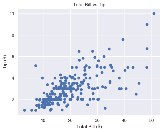
Let’s make a scatter plot of total_bill against tip. It’s very easy to do in matplotlib – use the plt.scatter() function. First, we pass the x-axis variable, then the y-axis one. We call the former the independent variable and the latter the dependent variable. A scatter graph shows what happens to the dependent variable (y) when we change the independent variable (x).
plt.scatter(total_bill, tip)

plt.show()
Nice! It looks like there is a positive correlation between a total_bill and tip. This means that as the bill increases, so does the tip. So we should try and get our customers to spend as much as possible.
Matplotlib Scatter Plot with Labels
Labels are the text on the axes. They tell us more about the plot and is it essential you include them on every plot you make.
Let’s add some axis labels and a title to make our scatter plot easier to understand.
plt.scatter(total_bill, tip)

plt.title('Total Bill vs Tip')

plt.xlabel('Total Bill ($)')

plt.ylabel('Tip ($)')

plt.show()
Much better. To save space, we won’t include the label or title code from now on, but make sure you do.
This looks nice but the markers are quite large. It’s hard to see the relationship in the $10-$30 total bill range.
We can fix this by changing the marker size.
Matplotlib Scatter Marker Size
The s keyword argument controls the size of markers in plt.scatter(). It accepts a scalar or an array.
Matplotlib Scatter Marker Size – Scalar
In plt.scatter(), the default marker size is s=72.
This means that if we want a marker to have area 5, we must write s=5**2.
The other matplotlib functions do not define marker size in this way. For most of them, if you want markers with area 5, you write s=5. We’re not sure why plt.scatter() defines this differently.
One way to remember this syntax is that graphs are made up of square regions. Markers color certain areas of those regions. To get the area of a square region, we do length**2. For more info, check out this Stack Overflow answer.
To set the best marker size for a scatter plot, draw it a few times with different s values.
# Small s

plt.scatter(total_bill, tip, s=1)

plt.show()
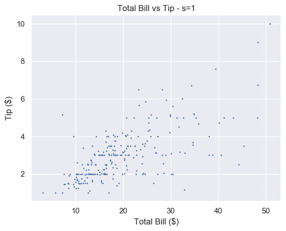
A small number makes each marker small. Setting s=1 is too small for this plot and makes it hard to read. For some plots with a lot of data, setting s to a very small number makes it much easier to read.
# Big s

plt.scatter(total_bill, tip, s=100)

plt.show()
Alternatively, a large number makes the markers bigger. This is too big for our plot and obscures a lot of the data.
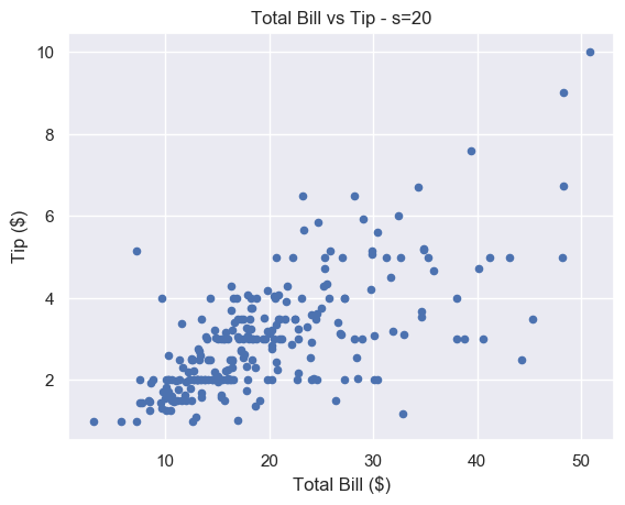
We think that s=20 strikes a nice balance for this particular plot.
# Just right

plt.scatter(total_bill, tip, s=20)

plt.show()
There is still some overlap between points but it is easier to spot. And unlike for s=1, you don’t have to strain to see the different markers.
Matplotlib Scatter Marker Size – Array
If we pass an array to s, we set the size of each point individually. This is incredibly useful let’s use show more data on our scatter plot. We can use it to modify the size of our markers based on another variable.
You also recorded the size of each of table you waited. This is stored in the NumPy array size_of_table. It contains integers in the range 1-6, representing the number of people you served.
# Select column 'size' and turn into a numpy array

size_of_table = tips_df['size'].to_numpy() # Increase marker size to make plot easier to read

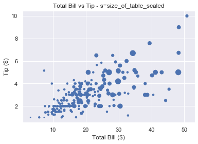
size_of_table_scaled = [3*s**2 for s in size_of_table] plt.scatter(total_bill, tip, s=size_of_table_scaled)

plt.show()
Not only does the tip increase when total bill increases, but serving more people leads to a bigger tip as well. This is in line with what we’d expect and it’s great our data fits our assumptions.
Why did we scale the size_of_table values before passing it to s? Because the change in size isn’t visible if we set s=1, …, s=6 as shown below.
So we first square each value and multiply it by 3 to make the size difference more pronounced.
We should label everything on our graphs, so let’s add a legend.
Matplotlib Scatter Legend
To add a legend we use the plt.legend() function. This is easy to use with line plots. If we draw multiple lines on one graph, we label them individually using the label keyword. Then, when we call plt.legend(), matplotlib draws a legend with an entry for each line.
But we have a problem. We’ve only got one set of data here. We cannot label the points individually using the label keyword.
How do we solve this problem?
We could create 6 different datasets, plot them on top of each other and give each a different size and label. But this is time-consuming and not scalable.
Fortunately, matplotlib has a scatter plot method we can use. It’s called the legend_elements() method because we want to label the different elements in our scatter plot.
The elements in this scatter plot are different sizes. We have 6 different sized points to represent the 6 different sized tables. So we want legend_elements() to split our plot into 6 sections that we can label on our legend.
Let’s figure out how legend_elements() works. First, what happens when we call it without any arguments?
# legend_elements() is a method so we must name our scatter plot

scatter = plt.scatter(total_bill, tip, s=size_of_table_scaled) legend = scatter.legend_elements() print(legend)

# ([], [])
Calling legend_elements() without any parameters, returns a tuple of length 2. It contains two empty lists.
The docs tell us legend_elements() returns the tuple (handles, labels). Handles are the parts of the plot you want to label. Labels are the names that will appear in the legend. For our plot, the handles are the different sized markers and the labels are the numbers 1-6. The plt.legend() function accepts 2 arguments: handles and labels.
The plt.legend() function accepts two arguments: plt.legend(handles, labels). As scatter.legend_elements() is a tuple of length 2, we have two options. We can either use the asterisk * operator to unpack it or we can unpack it ourselves.
Both produce the same result. The matplotlib docs use method 1. Yet method 2 gives us more flexibility. If we don’t like the labels matplotlib creates, we can overwrite them ourselves (as we will see in a moment).
Currently, handles and labels are empty lists. Let’s change this by passing some arguments to legend_elements().
Now let’s look at the contents of handles and labels.
>>> type(handles)

list

>>> len(handles)

6 >>> handles

[<matplotlib.lines.Line2D object at 0x1a2336c650>,

<matplotlib.lines.Line2D object at 0x1a2336bd90>,

<matplotlib.lines.Line2D object at 0x1a2336cbd0>,

<matplotlib.lines.Line2D object at 0x1a2336cc90>,

<matplotlib.lines.Line2D object at 0x1a2336ce50>,

<matplotlib.lines.Line2D object at 0x1a230e1150>]
Handles is a list of length 6. Each element in the list is a matplotlib.lines.Line2D object. You don’t need to understand exactly what that is. Just know that if you pass these objects to plt.legend(), matplotlib renders an appropriate 'picture'. For colored lines, it’s a short line of that color. In this case, it’s a single point and each of the 6 points will be a different size.
It is possible to create custom handles but this is out of the scope of this article. Now let’s look at labels.
Again, we have a list of length 6. Each element is a string. Each string is written using LaTeX notation '$...$'. So the labels are the numbers 3, 12, 27, 48, 75 and 108.
Why these numbers? Because they are the unique values in the list size_of_table_scaled. This list defines the marker size.
We used these numbers because using 1-6 is not enough of a size difference for humans to notice.
However, for our legend, we want to use the numbers 1-6 as this is the actual table size. So let’s overwrite labels.
labels = ['1', '2', '3', '4', '5', '6']
Note that each element must be a string.
We now have everything we need to create a legend. Let’s put this together.
# Increase marker size to make plot easier to read

size_of_table_scaled = [3*s**2 for s in size_of_table] # Scatter plot with marker sizes proportional to table size

scatter = plt.scatter(total_bill, tip, s=size_of_table_scaled) # Generate handles and labels using legend_elements method

handles, labels = scatter.legend_elements(prop='sizes') # Overwrite labels with the numbers 1-6 as strings

labels = ['1', '2', '3', '4', '5', '6'] # Add a title to legend with title keyword

plt.legend(handles, labels, title='Table Size')

plt.show()
Perfect, we have a legend that shows the reader exactly what the graph represents. It is easy to understand and adds a lot of value to the plot.
Now let’s look at another way to represent multiple variables on our scatter plot: color.
Matplotlib Scatter Plot Color
Color is an incredibly important part of plotting. It could be an entire article in itself. Check out the Seaborn docs for a great overview.
Color can make or break your plot. Some color schemes make it ridiculously easy to understand the data. Others make it impossible.
However, one reason to change the color is purely for aesthetics.
We choose the color of points in plt.scatter() with the keyword c or color.
You can set any color you want using an RGB or RGBA tuple (red, green, blue, alpha). Each element of these tuples is a float in [0.0, 1.0]. You can also pass a hex RGB or RGBA string such as '#1f1f1f'. However, most of the time you’ll use one of the 50+ built-in named colors. The most common are:
'b' or 'blue'
'r' or 'red'
'g' or 'green'
'k' or 'black'
'w' or 'white'
Here’s the plot of total_bill vs tip using different colors
For each plot, call plt.scatter() with total_bill and tip and set color (or c) to your choice
# Blue (the default value)

plt.scatter(total_bill, tip, color='b') # Red

plt.scatter(total_bill, tip, color='r') # Green

plt.scatter(total_bill, tip, c='g') # Black

plt.scatter(total_bill, tip, c='k')
Note: we put the plots on one figure to save space. We’ll cover how to do this in another article (hint: use plt.subplots())
Matplotlib Scatter Plot Different Colors
Our restaurant has a smoking area. We want to see if a group sitting in the smoking area affects the amount they tip.
We could show this by changing the size of the markers like above. But it doesn’t make much sense to do so. A bigger group logically implies a bigger marker. But marker size and being a smoker don’t have any connection and may be confusing for the reader.
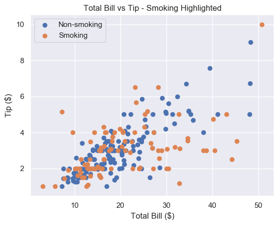
Instead, we will color our markers differently to represent smokers and non-smokers.
This looks great. It’s very easy to tell the orange and blue markers apart. The only problem is that we don’t know which is which. Let’s add a legend.
As we have 2 plt.scatter() calls, we can label each one and then call plt.legend().
# Add label names to each scatter plot

plt.scatter(non_smoking_total_bill, non_smoking_tip, label='Non-smoking')

plt.scatter(smoking_total_bill, smoking_tip, label='Smoking') # Put legend in upper left corner of the plot

plt.legend(loc='upper left')

plt.show()
Much better. It seems that the smoker’s data is more spread out and flat than non-smoking data. This implies that smokers tip about the same regardless of their bill size. Let’s try to serve less smoking tables and more non-smoking ones.
This method works fine if we have separate data. But most of the time we don’t and separating it can be tedious.
Thankfully, like with size, we can pass can array/sequence.
Let’s say we have a list smoker that contains 1 if the table smoked and 0 if they didn’t.
plt.scatter(total_bill, tip, c=smoker)

plt.show()
Note: if we pass an array/sequence, we must the keyword c instead of color. Python raises a ValueError if you use the latter.
ValueError: 'color' kwarg must be an mpl color spec or sequence of color specs.

For a sequence of values to be color-mapped, use the 'c' argument instead.
Great, now we have a plot with two different colors in 2 lines of code. But the colors are hard to see.
Matplotlib Scatter Colormap
A colormap is a range of colors matplotlib uses to shade your plots. We set a colormap with the cmap argument. All possible colormaps are listed here.
We’ll choose 'bwr' which stands for blue-white-red. For two datasets, it chooses just blue and red.
If color theory interests you, we highly recommend this paper. In it, the author creates bwr. Then he argues it should be the default color scheme for all scientific visualizations.
As we have one plt.scatter() call, we must use scatter.legend_elements() like we did earlier. This time, we’ll set prop='colors'. But since this is the default setting, we call legend_elements() without any arguments.
# legend_elements() is a method so we must name our scatter plot

scatter = plt.scatter(total_bill, tip, c=smoker_num, cmap='bwr') # No arguments necessary, default is prop='colors'

handles, labels = scatter.legend_elements() # Print out labels to see which appears first

print(labels)

# ['$\\mathdefault{0}$', '$\\mathdefault{1}$']
We unpack our legend into handles and labels like before. Then we print labels to see the order matplotlib chose. It uses an ascending ordering. So 0 (non-smokers) is first.
Now we overwrite labels with descriptive strings and pass everything to plt.legend().
# Re-name labels to something easier to understand

labels = ['Non-Smokers', 'Smokers'] plt.legend(handles, labels)

plt.show()
This is a great scatter plot. It’s easy to distinguish between the colors and the legend tells us what they mean. As smoking is unhealthy, it’s also nice that this is represented by red as it suggests 'danger'.
What if we wanted to swap the colors?
Do the same as above but make the smoker list 0 for smokers and 1 for non-smokers.
smokers_swapped = [1 - x for x in smokers]
Finally, as 0 comes first, we overwrite labels in the opposite order to before.
labels = ['Smokers', 'Non-Smokers']
Matplotlib Scatter Marker Types
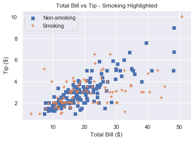
Instead of using color to represent smokers and non-smokers, we could use different marker types.
There are over 30 built-in markers to choose from. Plus you can use any LaTeX expressions and even define your own shapes. We’ll cover the most common built-in types you’ll see. Thankfully, the syntax for choosing them is intuitive.
In our plt.scatter() call, use the marker keyword argument to set the marker type. Usually, the shape of the string reflects the shape of the marker. Or the string is a single letter matching to the first letter of the shape.
Here are the most common examples:
'o' – circle (default)
'v' – triangle down
'^' – triangle up
's' – square
'+' – plus
'D' – diamond
'd' – thin diamond
'$...$' – LaTeX syntax e.g. '$\pi$' makes each marker the Greek letter π.
Let’s see some examples
For each plot, call plt.scatter() with total_bill and tip and set marker to your choice
# Circle

plt.scatter(total_bill, tip, marker='o') # Plus

plt.scatter(total_bill, tip, marker='+') # Diamond

plt.scatter(total_bill, tip, marker='D') # Triangle Up

plt.scatter(total_bill, tip, marker='^')
At the time of writing, you cannot pass an array to marker like you can with color or size. There is an open GitHub issue requesting that this feature is added. But for now, to plot two datasets with different markers, you need to do it manually.
Remember that if you draw multiple scatter plots at once, matplotlib colors them differently. This makes it easy to recognise the different datasets. So there is little value in also changing the marker type.
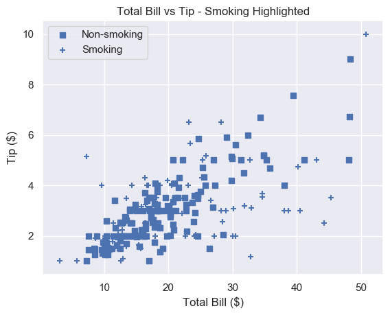
To get a plot in one color with different marker types, set the same color for each plot and change each marker.
# Square marker, blue color

plt.scatter(non_smoking_total_bill, non_smoking_tip, marker='s', c='b' label='Non-smoking') # Plus marker, blue color

plt.scatter(smoking_total_bill, smoking_tip, marker='+', c='b' label='Smoking') plt.legend(loc='upper left')

plt.show()
Most would agree that different colors are easier to distinguish than different markers. But now you have the ability to choose.
Summary
You now know the 4 most important things to make excellent scatter plots.
You can make basic matplotlib scatter plots. You can change the marker size to make the data easier to understand. And you can change the marker size based on another variable.
You’ve learned how to choose any color imaginable for your plot. Plus you can change the color based on another variable.
To add personality to your plots, you can use a custom marker type.
Finally, you can do all of this with an accompanying legend (something most Pythonistas don’t know how to use!).
Where To Go From Here
Do you want to earn more money? Are you in a dead-end 9-5 job? Do you dream of breaking free and coding full-time but aren’t sure how to get started?
Becoming a full-time coder is scary. There is so much coding info out there that it’s overwhelming.
Most tutorials teach you Python and tell you to get a full-time job.
That’s ok but why would you want another office job?
Don’t you crave freedom? Don’t you want to travel the world? Don’t you want to spend more time with your friends and family?
There are hardly any tutorials that teach you Python and how to be your own boss. And there are none that teach you how to make six figures a year.
Until now.
We are full-time Python freelancers. We work from anywhere in the world. We set our own schedules and hourly rates. Our calendars are booked out months in advance and we have a constant flow of new clients.
Sounds too good to be true, right?
Not at all. We want to show you the exact steps we used to get here. We want to give you a life of freedom. We want you to be a six-figure coder.
Click the link below to watch our pure-value webinar. We show you the exact steps to take you from where you are to a full-time Python freelancer. These are proven, no-BS methods that get you results fast.
It doesn’t matter if you’re a Python novice or Python pro. If you are not making six figures/year with Python right now, you will learn something from this webinar.
Click the link below now and learn how to become a Python freelancer.






![[Image: Nike-Flyknit-Racer-Pistachio-526628-103-...00x449.jpg]](https://fastsole.co.uk/wp-content/uploads/2017/05/Nike-Flyknit-Racer-Pistachio-526628-103-Buy-New-Sneakers-Trainers-FOR-Man-Women-in-UK-Europe-EU-03-700x449.jpg)
![[Image: 22-09-2017_adidas_womensnmd_cs2pkw_pearl...mg_2_1.jpg]](https://media.endclothing.com/media/f_auto,w_600,h_600/prodmedia/media/catalog/product/2/2/22-09-2017_adidas_womensnmd_cs2pkw_pearlgrey_white_ba7213_mg_2_1.jpg)
![[Image: bluz.jpg]](https://sneakersteal.com/wp-content/uploads/2018/05/bluz.jpg)