


Last modified on July 22nd, 2020.
Are you interested in creating an image editor tool? If so, this article will help you to get started with it.
An image editor will have a range of tools. It can be very basic with only tools like resize, rotate and crop. Or it can be super extensive like a Photoshop.
Rotate is a basic and essential tool that is part of any image editor. Let us start with something easy and basic like rotate then add some more essential tools.
I will be using CSS transform property as the core and add JavaScript to enrich the tool.
This can become a basic starter toolkit that can be expanded to a full fledged image editor in the future.
Following is a preview of the things to come.
What is inside?
- How to edit an image?
- A quick glance on CSS transform and image editing
- Examples and demo on image editing
- Conditions and exceptions on applying transform property
- Importance of respecting system preferences
How to edit an image?
Do not underestimate the power of CSS. Gone or those days, where CSS just applies decoration on top of HTML and beautifies the document. CSS3 and beyond, with the combined support of HTML5, advancements in the browser support has change CSS to a powerful UI tool.
It complements well with the JavaScript. When we combine it together, we can create wonders. The divide between thin-client and thick-client has vanished. The CSS is a very good beginner’s tool to start with simple image editor features.
When you work on image editing capabilities with CSS, you must consider browser compatibility. Some browsers will not render as you code. So, we have to be carefully choosing the properties.
I have used CSS keyframesrules to set the core properties.
In an older article, we have see several animation effects with CSS and Javascript.
In this article, you can find the example code of the below items with a demo.
- Rotation and spin
- Skew
- Scale
- Translation
A quick glance on CSS transform and image editing
CSS transform property can be used to do basic image editing. It supports functions like rotation, skew, scale and translate.
The key functions are rotate(), skew(), scale(), translate().
The transform functions have classification based on the axis of animation. For example rotateX(), rotateY() and more. This can be used for image animation.
We can apply the transform functions in a combination way for a single UI element’s selector. When we use many transform function, the animation effects happen in a right to left order.
Examples and demo on image editing
Scaling an image
The scaling is a transform function that allows us to scale up or down the element’s dimension. The scaling transform output varies based on the function used and its parameters.
The scale() function can have single or dual parameters. With a single parameter, it applies uniform scaling in both x, y-axis. When we supply separate values for the x, y-axis, then the scaling range will vary.
With three params the scale3d() function allows scaling in x,y,z axis.
We can also apply scaling with respect to single axis by using scaleX(), scaleY() or scaleZ().
The above demo has a slider to scale up and down an image.
Below code has the UI elements to apply scaling transform on an image element. It has a pallet with an image element and animation tools.
image-scale/index.php
<!DOCTYPE html>

<html>

<head>

<meta name="viewport" content="width=device-width, initial-scale=1">

<link href="../assets/css/phppot-style.css" type="text/css" rel="stylesheet" />

<link href="./assets/css/style.css" type="text/css" rel="stylesheet" />

<link href="../vendor/jquery/ui/jquery-ui.min.css" type="text/css" rel="stylesheet" />

<script src='../vendor/jquery/jquery-3.3.1.js' type='text/javascript'></script>

<script src='../vendor/jquery/ui/jquery-ui.min.js' type='text/javascript'></script>

</head> <body> <div class="phppot-container"> <div class="container"> <div class="image-demo-box"> <div id="slider"> <div id="scale-handle" class="ui-slider-handle"></div> </div> <img src='../sweet.jpg' id='image' /> </div> </div> </div> <script src='./assets/js/scale.js'></script>

</body>

</html>
This jQuery script initiates UI slider by setting the min max ranges. The slider handle will show the scaling factor.
On dragging the slider, the script applies scaling transform on the image element. The slider’s step property defines the scaling multiples.
On dragging the slider handle, the script will populate the scaling factor in the handle.
image-scale/assets/js/scale.js
$(document).ready(function() { var scaleX = 2; var handle = $("#scale-handle"); $("#slider").slider({ min : 1, max : 2.5, value: scaleX, step: 0.1, create : function() { handle.text(scaleX+"x"); scale(scaleX); }, slide : function(event, ui) { scaleX = ui.value; handle.text(scaleX + "x"); scale(scaleX); } });

}); function scale(scaleX) { $('#image').css('transform', 'scale(' + scaleX + ')');

}
Translating image element
Like other transform functionality, the translate() function performs 2D, 3D translation.
The translate() function with one or two params results in 2D translation. The two params are to move the image in the x, y-axis of a 2D plane. With single param, the translate() will happen in a horizontal direction.
The translateX() and translateY() are for implementing translation in a particular direction.
The translate3d() with x, y, z factors allows creating 3D animation.
In this demo, there are two sliders in horizontal and vertical directions. On dragging the handle of these sliders, it moves the image on the 2D plane shown above.
This HTML shows the template elements to set the image-translate demo.
image-translate/index.php
<!DOCTYPE html>

<html>

<head>

<meta name="viewport" content="width=device-width, initial-scale=1">

<link href="../assets/css/phppot-style.css" type="text/css" rel="stylesheet" />

<link href="./assets/css/style.css" type="text/css" rel="stylesheet" />

<link href="../vendor/jquery/ui/jquery-ui.min.css" type="text/css" rel="stylesheet" />

<script src='../vendor/jquery/jquery-3.3.1.js' type='text/javascript'></script>

<script src='../vendor/jquery/ui/jquery-ui.min.js' type='text/javascript'></script>

</head> <body> <div class="phppot-container"> <div class="container"> <div class="image-demo-box"> <div id="slider"> <div id="translate-x" class="ui-slider-handle"></div> </div> <div id="v-slider"> <div id="translate-y" class="ui-slider-handle"></div> </div> <img src='../sweet.jpg' id='image' /> </div> </div> </div> <script src='./assets/js/translate.js'></script>

</body>

</html>
This script sets the horizontal and vertical translation slider properties. The horizontal slider has the range between o -160. And, the vertical translation ranges between 0 to 50.
image-translate/assets/js/translate.js
$(document).ready(function() { var translateX; var handle = $("#translate-x"); $("#slider").slider({ range : "min", min : 0, max : 160, create : function() { handle.text($(this).slider("value") + " px"); }, slide : function(event, ui) { translateX = ui.value; handle.text(translateX + " px"); translate(translateX); } }); var translateY; var vhandle = $("#translate-y"); $("#v-slider").slider({ range : "min", min : 0, max : 50, orientation : "vertical", create : function() { vhandle.text($(this).slider("value") + " px"); }, slide : function(event, ui) { translateY = ui.value; vhandle.text(translateY + " px"); translatey(translateY); } }); }); function translate(translateX) { $('#image').css('transform', 'translateX(' + translateX + 'px)');

} function translatey(translateY) { $('#image').css('transform', 'translateY(' + translateY + 'px)');

}
Tools for rotating an image
Ah yes, we have reached the rotate tool. This is a core feature in any image editor. Rotation spins the image or other UI elements based on the angle specified.
With a negative degree, the animation will happen in counter-clockwise rotation.
Like scale and translate, rotate function also has classification based on the axis. Those are,
- rotate(angle)
- rotate3d(x, y, z, angle)
- rotateX(angle)
- rotateY(angle)
- rotateZ(angle)
The rotate3d() function needs the angle and the x, y, z co-ordinates of the rotation axis.
A spin will make the image rotate from 0 to 360 degrees. You can stop spinning or refresh the image orientation back to its original.
image-rorate/index.php
<!DOCTYPE html>

<html>

<head>

<meta name="viewport" content="width=device-width, initial-scale=1">

<link href="../assets/css/phppot-style.css" type="text/css" rel="stylesheet" />

<link href="./assets/css/style.css" type="text/css" rel="stylesheet" />

<link href="../vendor/jquery/ui/jquery-ui.min.css" type="text/css" rel="stylesheet" />

<script src='../vendor/jquery/jquery-3.3.1.js' type='text/javascript'></script>

<script src='../vendor/jquery/ui/jquery-ui.min.js' type='text/javascript'></script>

</head> <body> <div class="phppot-container"> <div class="container"> <input type='text' id='txtInputAngle' class="degree" value="10" /> <input type='button' id='btnRotate' value='Rotate' /> <input type='button' id='btnSpin' value='Spin' data-state='off' /> <input type='button' id='btnRefresh' value='Refresh' /> <div class="image-demo-box"> <div id="slider"> <div id="rotation-angle" class="ui-slider-handle"></div> </div> <img src='../sweet.jpg' id='image' /> </div> </div> </div> <script src='./assets/js/rotate.js'></script>

</body>

</html>
I have used CSS keyframes to allow continuous spinning. Below CSS shows the styles used for the image rotation demo.
image-rorate/assets/css/style.css
.image-demo-box { border: #CCC 1px solid; text-align: center; margin: 15px 0px; } input[type=button] { width: 65px; margin-right: 8px; outline: none; background: #f6f5f6;

} input.degree

{ width: 50px;

} #image { margin: 50px auto; border: #f6f5f6 10px solid; width: 200px;

}

.rotate { animation: rotation 8s infinite linear;

} div#slider { border-bottom: 1px solid #c5c5c5;

} #slider .ui-slider-range { background: #c5c5c5; } #rotation-angle { width: 50px; padding: 3px 5px 1px 5px; font-size: 0.8em; text-align: center; border-radius: 2px; outline: none; } .ui-slider-handle.ui-corner-all.ui-state-default { border: 1px solid #c5c5c5; background: #f6f6f6; font-weight: normal; color: #454545;

} @keyframes rotation { from { transform: rotate(0deg); } to { transform: rotate(359deg); }

}
When you click the rotation tool, a jQuery script rotates the image based on the specified angle.
It changes the images’ transform property using jQuery $.css() function.
The rotation slider ranges from 0 to 360 degrees. I have added the rotation script below. It shows how to turn on a jQuery UI slider to rotate an image element.
image-rorate/assets/js/rotate.js
$(document).ready(function() { var rotationAngle; var handle = $("#rotation-angle"); $("#slider").slider({ range : "min", min : 0, max : 360, create : function() { handle.text($(this).slider("value") + " deg"); }, slide : function(event, ui) { $('#image').removeClass('rotate'); rotationAngle = ui.value; handle.text(rotationAngle + " deg"); rotate(rotationAngle); } }); $('#btnSpin').on('click', function() { if ($(this).data('state') == 'off') { spin($(this)); } else { stopSpin($(this)); } }); $('#btnRotate').on('click', function() { $('#image').removeClass('rotate'); rotationAngle = $('#txtInputAngle').val(); rotate(rotationAngle); }); $('#btnRefresh').on('click', function() { $('#image').removeClass('rotate'); rotate(0); });

}); function spin(buttonElement) { $('#image').addClass('rotate'); $("#image").css("animation-play-state", "running"); $(buttonElement).data('state', 'on'); $(buttonElement).val('Stop');

} function stopSpin(buttonElement) { $("#image").css("animation-play-state", "paused"); $(buttonElement).data('state', 'off'); $(buttonElement).val('Spin');

} function rotate(rotationAngle) { if ($('#btnSpin').data('state') == 'on') { stopSpin($('#btnSpin')); } $('#image').css('transform', 'rotate(' + rotationAngle + 'deg)');

}
Apply skew transform
By changing each point of the element in a fixed direction will skew the element. This change will tilt or skews the elements layout based on the specified angle.
The skew transform functions skewX(), skewY(), skewZ() tilting element boxes along with the X, Y, Z axis.
image-skew/index.php
<!DOCTYPE html>

<html>

<head>

<meta name="viewport" content="width=device-width, initial-scale=1">

<link href="../assets/css/phppot-style.css" type="text/css" rel="stylesheet" />

<link href="./assets/css/style.css" type="text/css" rel="stylesheet" />

<link href="../vendor/jquery/ui/jquery-ui.min.css" type="text/css" rel="stylesheet" />

<script src='../vendor/jquery/jquery-3.3.1.js' type='text/javascript'></script>

<script src='../vendor/jquery/ui/jquery-ui.min.js' type='text/javascript'></script>

</head> <body> <div class="phppot-container"> <div class="container"> <div class="image-demo-box"> <div id="slider"> <div id="skew-angle" class="ui-slider-handle"></div> </div> <img src='../sweet.jpg' id='image' /> </div> </div> </div> <script src='./assets/js/skew.js'></script>

</body>

</html>
image-skew/assets/js/skew.js
$(document).ready(function() { var skewAngle; var handle = $("#skew-angle"); $("#slider").slider({ range : "min", min : 0, max : 40, create : function() { handle.text($(this).slider("value") + " deg"); }, slide : function(event, ui) { skewAngle = ui.value; handle.text(skewAngle + " deg"); skew(skewAngle); } }); });

function skew(skewAngle) { $('#image').css('transform', 'skew(' + skewAngle + 'deg)'); }
Conditions and exceptions on applying transform property
The CSS transform property will not work with some UI elements.
For example, table column element <col>, table column group element <col-group>, and more. Those are non-transformable elements.
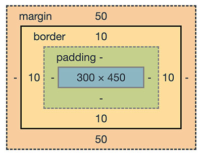
What are transformable elements?
Most of the UI elements enclosed with the CSS box model are transformable. The following image shows the HTML element layout enclosed by a CSS box model.
Also, renderable graphical elements, clipPath elements are also known as a transformable element.
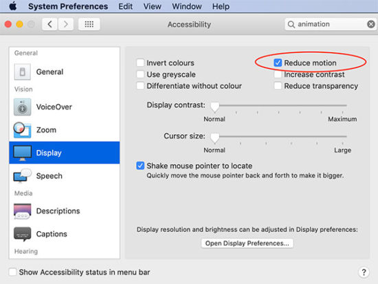
Importance of respecting system preferences
The system preferences will affect the motion of elements. If your system preferences is set to reduce animation is on, it will omit the animation effect of the above demo.
To respect this settings we have to add a CSS media rule to set the
prefers-reduced-motion. The possible values are no-preferences and reduce.
This media rule with reduce option provides a CSS block to suppress animation.
@media (prefers-reduced-motion: reduce) { .rotate { transform: none; }

}
In the above examples, I have used the media rule to respect the user’s system preferences. You can test this with the demo by enabling the reduced-motion.
Conclusion
We have seen the CSS transform based image editing. This is just a beginning only. This can serve as a bootstrap for building a full fledged image editor.
With CSS transform, we have added JavaScript and enriched the tool. We have also added various motion effects.
I have added most of the template files and the jQuery scripts above. But you can find the complete bundle with the downloadable source code here below.
https://www.sickgaming.net/blog/2020/07/...transform/