Posted on Leave a comment

Behind the Design: Headspace

Few apps have made mindfulness as accessible as Headspace.

More than a decade since its launch, the app continues to set the standard for mental health apps — an especially notable accomplishment, as it can be difficult to communicate challenging topics like mindfulness and mental health through an app. “Demystification is a word we use a lot,” says Jeff Birkeland, Headspace senior vice president and general manager for member products. “Mindfulness and mental health can seem complex, perhaps mystical, maybe even inaccessible. So how do we make it approachable and friendly? And how do we get people to the right content faster?”

The answer is an intentional mix of design, organization, and style. “I think the root of our success from the very beginning was creating a warm feel and brand,” he says.

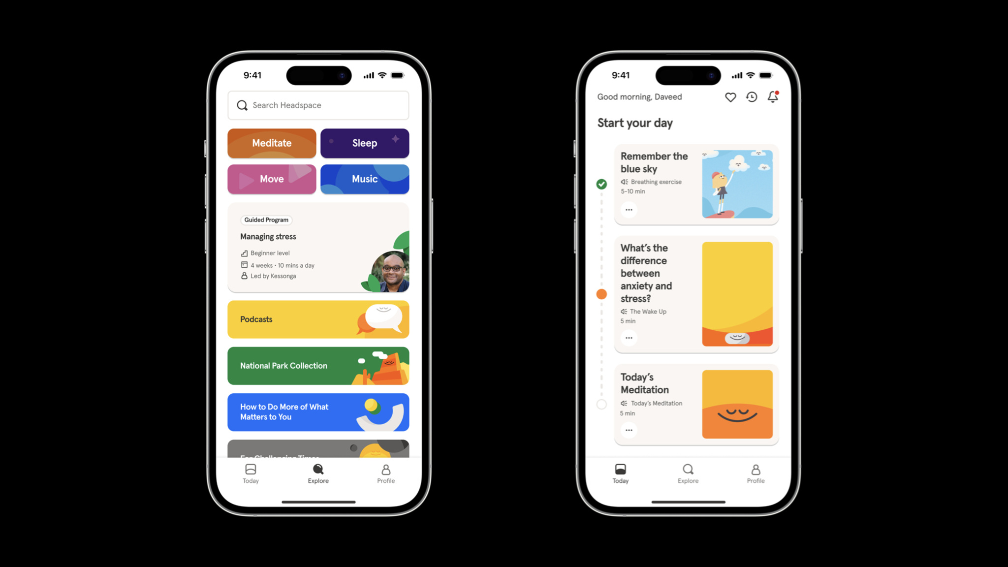
*Headspace* is easy to navigate, and its collections and activities are clearly labeled.

It’s hardly an overstatement to say that Headspace has been part of a tremendous social change regarding mental health. Birkeland says the app has been used by more than 100 million people in nearly 200 countries and regions, and it’s easy to see why. Headspace is an incredibly versatile tool for anyone looking for a quick clarity break, longer guided sessions, or help with sleep or exercise. And its huge library of resources is there whenever people need it.

Jeff Birkeland, *Headspace*

Headspace smartly organizes its library of resources through language. Collections and exercises are labeled with understandable purposes, like Unlocking Creativity, Mindful Eating, and The Shine Collection, a set of activities drawn from Headspace’s recent merger with Shine, a mindfulness app dedicated to providing inclusive and accessible mental health resources that support marginalized communities. “It’s still a simple app,” Birkeland says, “but it’s not a very long trip into an extensive archive.”

How do we make [mindfulness and mental health] approachable and friendly? And how do we get people to the right content faster?

Jeff Birkeland, Headspace senior vice president for member products

In previous versions of Headspace, the core navigation included tabs for meditation, focus, movement, and sleep. But Birkeland says user research convinced the team to strip away that complexity and focus instead on the app’s Today tab, which facilitates one-tap access to activities of varying lengths for morning, afternoon, and night. Importantly, it does so without bringing up specific categories.

*Headspace’s* illustration style and color scheme are part of the app’s mission to feel warm and friendly.

The Explore tab, meanwhile, is the gateway to that vast bank of content — including those former category-based parts of the core navigation. “There’s still simplicity at the surface,” says Birkeland. “But there’s an incredible depth of content underneath.” This tab is also where people find collections and activities of all kinds, including those with titles like Cultivating Black Joy and Navigating Injustice that illustrate Headspace’s commitment to representation.

“Mindfulness, meditation, mental health — none of these are easy to navigate,” Birkeland says. “An app that feels warm, friendly, and easy to use can provide approachable support for tough issues.”

Learn more about Headspace

Download Headspace from the App Store

Behind the Design is a series that explores design practices and philosophies from each of the winners of the Apple Design Awards. In each story, we go behind the screens with the developers and designers of these award-winning apps and games to discover how they brought their remarkable creations to life.

Explore more of the 2023 Behind the Design series

Posted on Leave a comment

Behind the Design: Any Distance

Workout tracking has never looked — or felt — like it does in Any Distance.

“We’re building something for everyone, not just athletes,” says Luke Beard, the Atlanta-based designer who created this Swift app with engineer Daniel Kuntz. “We’re not athletically inclined people. We’re kind of dorks! I want to retire and take photos in Iceland one day. Dan wants to retire and play music in the desert. We’re not looking to go to the Olympics, but we do want to live long, healthy lives.”

*Any Distance* presents its workout stats in a variety of eye-popping formats.

Their app is a design-forward fitness tracker and social network that delivers workout stats in beautiful and shareable formats — dynamic charts and graphs, animated 3D maps, AR experiences, and gorgeous cards — that can integrate photos. It draws heavily on SF Symbols — as Beard cheekily puts it, “SF Symbols is the single greatest contribution to design Apple has ever made.” It offers elegant in-app collectibles and an in-house social network aimed at connecting people with a small circle of friends. And its name is also its philosophy: Any Distance counts, not just a swim or bike ride, but a walking meeting, stroller run, or its most popular option, a dog walk.

Luke Beard, *Any Distance*

Any Distance is heavily powered by Apple tools and technologies. It uses ARKit for rendering routes, HealthKit for workout data, Metal rendering for what Kuntz calls the “gradient background swirly thing,” SceneKit for rendering, MapKit, Apple Watch integration, and more. It also demonstrates Any Distance’s commitment to privacy. “Your data is all in HealthKit; we don’t store it unless you post it to your friends,” Beard says. “We don’t let you share a map. Route clipping (in which the beginning and end of your routes are trimmed from public view) is on by default.” And people can choose exactly what data they want to share with friends by simply tapping the eye icon under each metric.

SF Symbols is the single greatest contribution to design Apple has ever made.

Luke Beard, Any Distance founder

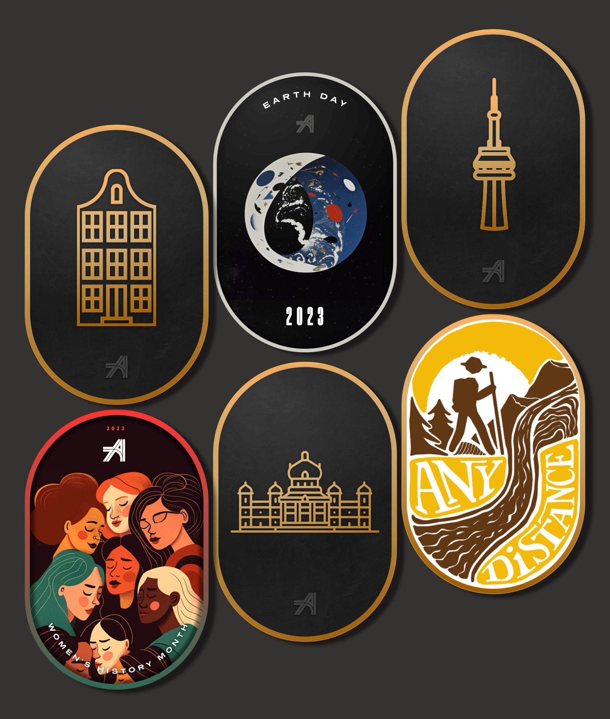
Beard conceived of the idea for Any Distance during the pandemic, when his lifestyle wasn’t quite as healthy as he would have liked. To shake himself out of his funk, he began going on long walks, posting photos of his journeys along the way. “I’m a chronic oversharer,” laughs Beard, “and a photographer at heart. And I was getting good feedback.” Eventually, he started designing templates for his social media posts. “Honestly, it was just a photo in a mask — the oval that’s now one of our main brand characteristics — with the route and stats in a fun font. But people would ask, ‘What app is making those?’”

Just a few of the spiffy medals you can earn by sharing workouts in *Any Distance.*

By this point, he’d already connected with Daniel Kuntz, a programmer and musician who already had a few titles on the App Store. “As a developer, I’m often asked, ‘Hey, can you make this app?’ And I’m always like, ‘Nah,’” says Kuntz. “In this case, Luke had it all fleshed out. He had iOS components and a Sketch file. It was simple and clear and really cool.”

This year, the team also plans to add more unorthodox activity options like trick-or-treating. “Eventually we want to organize group bike rides or group dog walks,” says Beard. “The last few years have accelerated the loneliness epidemic so much, and we think working out or being active together is the new hanging out. It doesn’t matter if you’re walking half a mile, taking a stroller walk with your kid, or walking with a cane — there should be a space for you.”

Download Any Distance from the App Store

Behind the Design is a series that explores design practices and philosophies from each of the winners of the Apple Design Awards. In each story, we go behind the screens with the developers and designers of these award-winning apps and games to discover how they brought their remarkable creations to life.

Explore more of the 2023 Behind the Design series

Posted on Leave a comment

Behind the Design: stitch.

For all its many genres and styles, the gaming world has been awfully threadbare when it comes to experiences about embroidery. That all changes with stitch., a charming cross between casual puzzler, meditative exercise, and afternoon craft project — and as cross-generational a game as you’re likely to find.

“We pride ourselves on making games that anyone can play,” says Jakob Lykkegaard, founder of Lykke Studios, the team behind stitch. “It’s important to spend the time to make them available for everyone.”

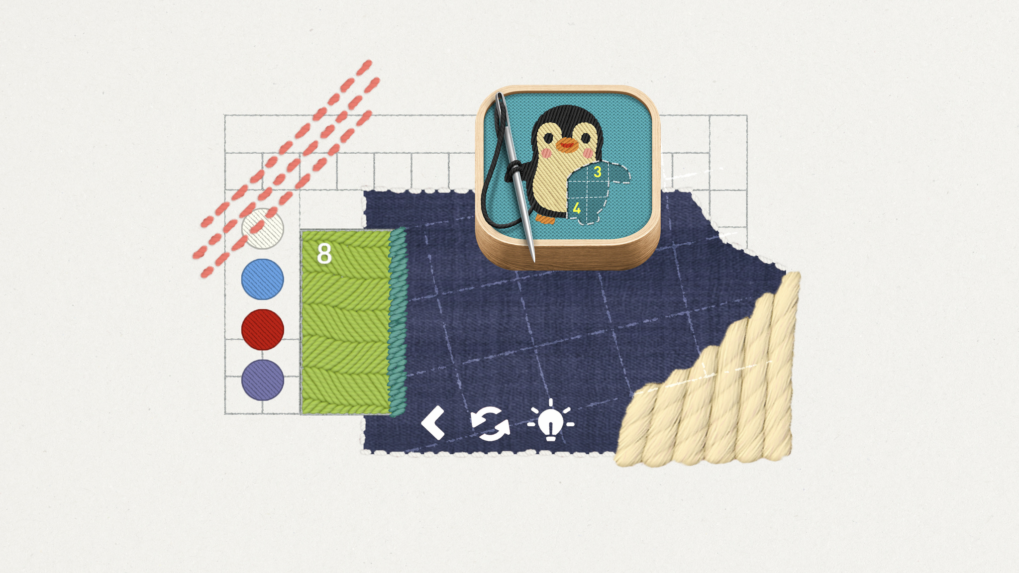
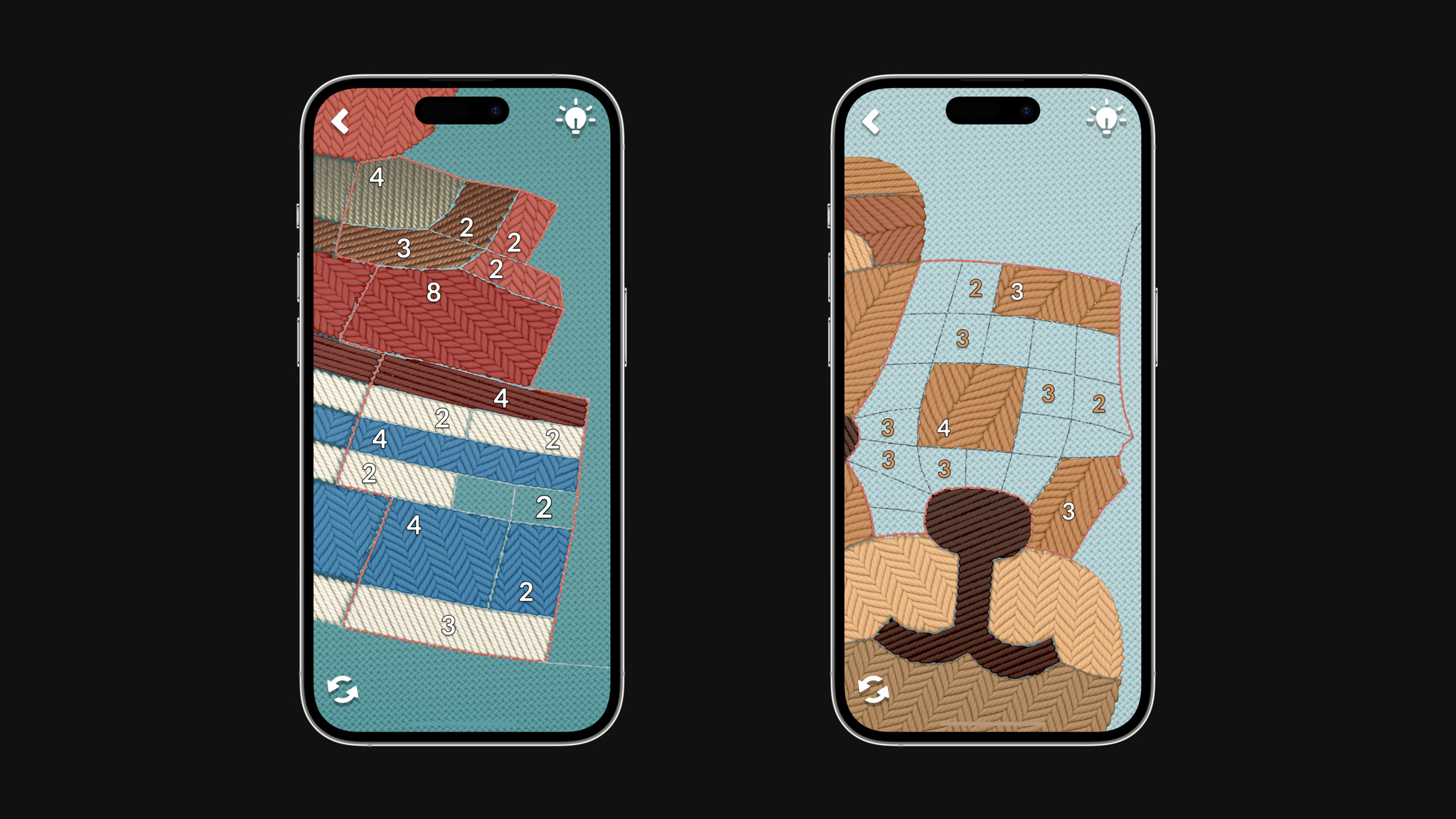
In *stitch.*, players solve number puzzles to fill out embroidery patterns — sometimes very cute ones.

stitch. sets up embroidery-based puzzles that players complete to finish a pattern, like an adorable penguin or a love note to bacon. Players swipe over an incredibly lifelike and beautifully textured surface that feels like it’s just beneath the display. There’s no linear progression in stitch.; challenges are presented in the form of “hoops” that players can explore at their own pace. And the game supports multiple languages and custom accessibility tools for people with color blindness, low vision, and motion sensitivities.

There’s precedent for those choices. Lykke Studios’ painting puzzler tint. was nominated for a 2022 Apple Design Award in the Inclusivity category, thanks in part to a colorblind mode that lets players solve each watercolor-based puzzle by using patterns and texture instead of color.

Jakob Lykkegaard, *stitch.*

With stitch., which was built with Unity, the studio explored accessibility features even further. “Number Outlines” creates sharper and more contrasting outlines on the puzzles’ numbers. “Big Numbers” makes them larger and easier to read. “Reduce Motion” limits sudden movements and animations. And the left-handed mode shifts problematic UI out of the way for left-handed players. Lykkegaard says, “Originally, the icon indicator was actually under the hand for left-handed people. We thought, ‘That’s an issue we hadn’t considered. How can we fix it?’”

We pride ourselves on making games that anyone can play.

Jakob Lykkegaard, founder of Lykke Studios

Lykkegaard says the team took an unusual approach to sewing up the idea for stitch. “We build games a little bit upside down,” he says. “It usually starts with us falling in love with some material and building a game mechanic around it later. We’ll see how it feels on device and, if it’s not working, we’ll kill the project and move on to another material.” For stitch., that material came from a serendipitous day on social media. “We honestly just saw a post about embroidery and thought, ‘Wow, that looks really nice.’”

The *stitch.* team created real-life test hoops as inspiration for the ones in the game.

For that mechanic, the team found inspiration in an unlikely analog source: a geometric grid-based puzzle game called Shikaku found in Japanese newspapers. “We took the grid and skewed it into something that looks nice but isn’t uniform,” he says. “From there, we had a lot of options for how players could fill it out.”

As with tint., the team looked to strike a balance that would challenge players without making them feel lost or intimidated. “We didn’t want to make a game like sudoku where people thought, ‘Oh, that’s too difficult for me.’ But we also didn’t want something that was just an endless series of careless clicks. stitch. couldn’t be too hard for kids, but it couldn’t be too childish either.”

It’s working. Lykkegaard has heard from 8-year-olds and 80-year-olds who’ve been drawn to the game’s approachable, accessible style. “The question is: How can we get a player to enjoy it, feel smart, and want to relax with the game? Once you’ve generated that feeling, players will come back. And we want to make everyone feel like this is a game for them.”

Learn more about stitch.

Download stitch. from Apple Arcade

Behind the Design is a series that explores design practices and philosophies from each of the winners of the Apple Design Awards. In each story, we go behind the screens with the developers and designers of these award-winning apps and games to discover how they brought their remarkable creations to life.

Explore more of the 2023 Behind the Design series

Posted on Leave a comment

Behind the Design: Flighty

Flighty might be the easiest thing travelers navigate on their entire trip. “Travel can be a high-stress situation,” says Ryan Jones, the Austin-based developer who founded the app in 2019. “We want Flighty to work so well that it feels almost boringly obvious.”

Conceived during — when else? — a long flight delay, Flighty puts key information front and center with an immediately understandable interface, live maps, and a look that mirrors time-honored airport design conventions. The best-in-class travel app is a flight tracker, airport navigator, and concierge — and with incredible implementations of Live Activities and the Dynamic Island, a companion that makes key information available at all times.

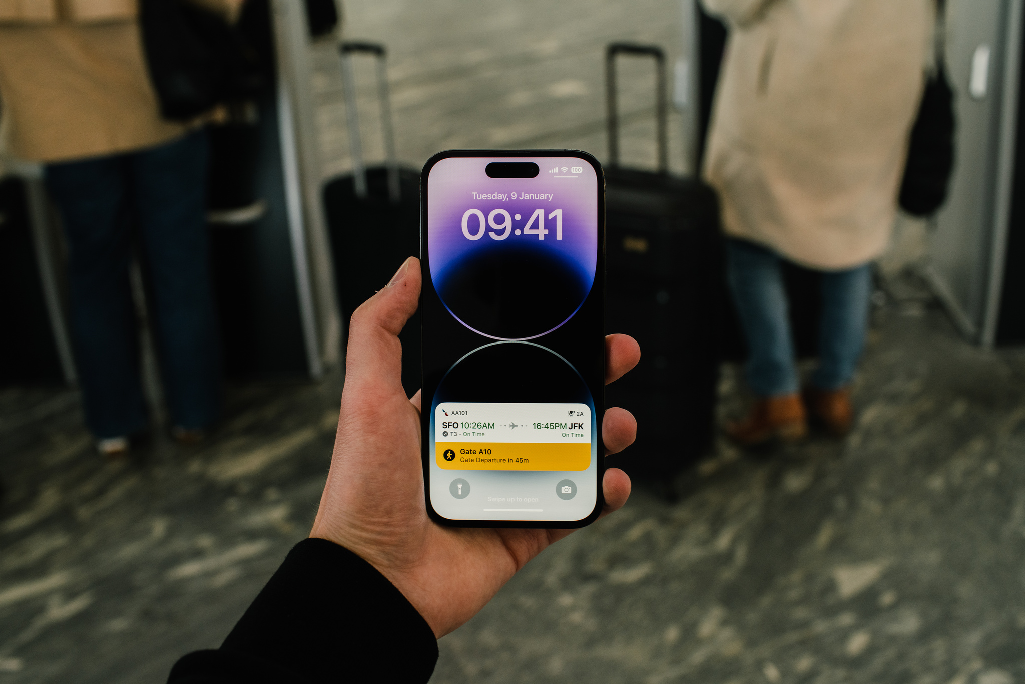
*Flighty* puts key information front and center at all times — especially through its best-in-class Live Activities.

“There’s something comforting about information always being there,” Jones says. “You don’t have to check your phone and think, ‘OK, I have to be at the gate in 32 minutes,’ and then, ‘Now I have to be there in 29 minutes.’ And I don’t know about you, but every time I walk on a plane, I look at my seat number, put it down, and immediately say, ‘Wait, what was my seat number?’”

Since its 2019 launch, Flighty has been an incredible example of the carefully crafted use of Apple technologies. “We’re really doing this out of a passion and love for the product,” says Jones, “We all had our lives changed by iOS and mobile, so we get really excited about adopting new technologies.”

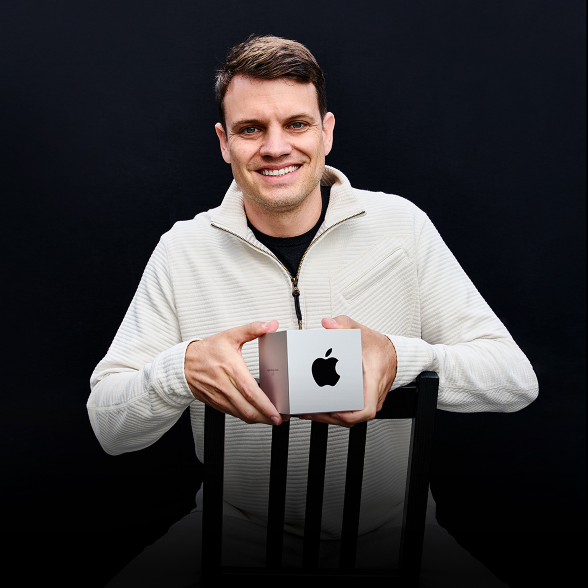
Ryan Jones, *Flighty*

They’ve added a lot. Flighty supports widgets on the Home Screen and Lock Screen, highlighting content using Shared with You, and more. With a few taps, travelers can even live-share their flight path and arrival time with loved ones who may not even have the app installed — a wonderfully convenient feature for coordinating airport pickups.

We want Flighty to work so well that it feels almost boringly obvious.

Ryan Jones, Flighty founder

Flighty is consistently impressive in adjusting to the unpredictable nature of travel. “We really have to shine when things go awry,” says Jones. For instance, the app must account for how every single person will, at some point, lose their internet connection. “Whenever [someone] takes off, we have to assume that we won’t see them again until they land,” says Jones. The solve? At a certain point before a flight takes off, the Dynamic Island switches over to flight progress bars and counters, displaying minimal presentation in a simple circular chart that tracks a flight’s duration.

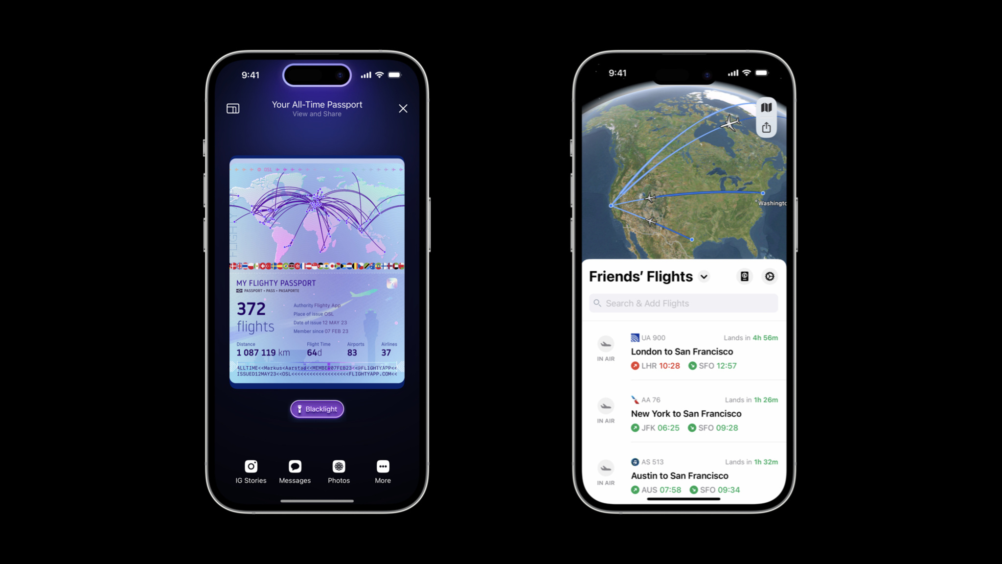
The *Flighty* Passport features shows your flights, miles, and travel stats, and the Friends' Flights screen is a convenient way to keep up with others.

Visually, both Live Activities and the Dynamic Island are designed to recall airport signage conventions that have been in place for decades. “That’s our real-world analogy,” Jones says. “Those airport boards have one line per flight, and that’s a good guiding light — they’ve had 50 years of figuring out what’s important.”

While the design process is comprehensive, it’s not always fast. “It’s so tempting to start pulling from your existing asset library to see if you can quickly put something together,” he says. To avoid falling back on old ideas, the Flighty team creates 20 design ideas during the concept phase. “It’s what fits on a sheet of paper,” he says with a smile. “You get to six or seven ideas and think, ‘OK, that’s it, there’s none left.’ But then you think, ‘Well, I have an idea that will probably look bad,’ and then you try it and it’s not bad at all.”

Flighty is even fun at home. The Flighty Passport feature shows flights, miles, and travel stats through gorgeous, shareable custom artwork. It’s just more proof that Flighty really is for every step of the journey — even being back home.

Learn more about Flighty

Download Flighty from the App Store

Behind the Design is a series that explores design practices and philosophies from each of the winners of the Apple Design Awards. In each story, we go behind the screens with the developers and designers of these award-winning apps and games to discover how they brought their remarkable creations to life.

Explore more of the 2023 Behind the Design series

Posted on Leave a comment

Behind the Design: Resident Evil Village

Evil has never looked better than it does in Resident Evil Village.

The AAA horror adventure is a masterpiece of visual detail on Mac, a feast of creepy castles, decrepit factories, and majestically gothic villains. The game’s bleak village is thick with details and dread; characters like Lady Dimitrescu and the game’s army of mutant lycans nearly pop out of the screen. Simply put, Resident Evil Village contains some of the most realistic graphics ever seen on Apple hardware. And the lavish visuals don’t just look amazing; they drag players into the game’s horrifying landscape and through dark mysteries, vicious confrontations, and mind-blowing plot twists.

*Resident Evil Village* makes desolation look incredible.

It’s all powered by a remarkable assembly of cutting-edge Apple technologies. Resident Evil Village takes full advantage of Apple silicon, ProMotion, Metal 3, and extended dynamic range to serve up its breathtaking visual achievements. “The game is very pretty, but it has this incredible sense of fear,” says Tsuyoshi Kanda, one of the game’s producers. “In some of the first scenes, you end up battling this horde of lycans. The sheer amount of them is impressive. But each has its own intention and personality. We’re happy with how it turned out.”

Those achievements are especially clear in the game’s village, which feels like a character in itself. The village shines in its decay; it’s a showcase of textures, geometry, and complex shaders. And players can enable MetalFX Upscaling to make it look especially breathtaking. Kazuki Kawato from the game’s engine team says the game benefits from both spatial and temporal upscaling. “Both were easy to use and gave us the results we wanted,” he says.

Tsuyoshi Kanda, *Resident Evil Village*

Masaru Ijuin, senior manager in the engine development team, says he always knew the game was beautiful. “Our main focus was taking the base game and making it run as fast and as stable as possible on Mac,” he says, “and I think we did that.”

Kanda calls out the Castle Dimitrescu, home of the game’s breakout villain, the 9-foot-tall vampire giantess Lady Dimitrescu. “The castle looks incredible no matter where you are,” he says. “There’s an entrance hall with a chandelier inside that we’re all really proud of. The team worked hard to create the best graphics possible on the hardware.”

The game’s visuals are deserving of acclaim, but Resident Evil Village also boasts an incredible story and character design. It’s a masterclass in horror pacing that skillfully mixes bursts of frantic action with long stretches of good old dread-building. Kanda says the team paid special attention to creating what he proudly calls a “variety of horrific entertainment.”

Lycans are on the move in this piece of early *Resident Evil Village* concept art.

“The concept is a horror theme park with characters that stand out against this beautifully rendered environment,” he says. “The stages cycle between horror and action to help players stay balanced. That’s something we learned from other Resident Evil games.”

Balance was also key in creating the game’s story, which had to fit into the Resident Evil universe (Village is the eighth major game in the series) while taking the storyline in wild new directions. “One of the base concepts was Ethan Winters at home with his wife and baby daughter, Rose,” says Kanda. “You see Ethan’s fatherly love all throughout the game.”

The concept is a horror theme park, with characters that stand out against this beautifully rendered environment.

Tsuyoshi Kanda, Resident Evil Village producer

But in the game’s intro, Rose is kidnapped from the family home in a shocking confrontation with Chris Redfield, a character who’s been around since the first Resident Evil. “Chris was such a big part of world-building this; the way he enters the game was so important,” says Kanda. “We didn’t want you to know his intentions until the ending.”

To get to that ending — which is as dramatic as Kanda promises — players must battle through a murderer’s row of memorable villains that look alive, even if they’re (probably?) not. There’s Salvatore Moreau, a hideous mutant; Karl Heisenberg, who runs a factory with some serious health-code violations; Donna Beneviento and her scary doll, which is probably all we need to say about that; and Lady Dimitrescu, the superstar with huge claws, a deathly gothic wardrobe, and a surprisingly devoted fan base.

The game’s myriad monsters look incredible (both inside and outside).

“The idea for Lady Dimitrescu was a huge character who was too big for the castle itself,” says Kanda. “She has to duck to get through the doors. And when she comes at you, you really feel her presence.”

As an incredible example of Mac gaming, Resident Evil makes its presence felt too. But this story has a twist ending of its own: Kanda, Ijuin, and Kawato personally aren’t all that into horror. “The (Resident Evil) creative team loves horror movies,” laughs Kanda, “but I’m more into the not-too-scary stuff.”

Learn more about Resident Evil Village

Download Resident Evil Village from the Mac App Store

Behind the Design is a series that explores design practices and philosophies from each of the winners of the Apple Design Awards. In each story, we go behind the screens with the developers and designers of these award-winning apps and games to discover how they brought their remarkable creations to life.

Explore more of the 2023 Behind the Design series

Posted on Leave a comment

Behind the Design: Railbound

For a creative guy, Luke Spierewka, founder of the Poland-based game studio Afterburn, is certainly a fan of limitations.

“We make comfy puzzle games that convey an idea quickly,” he says, “but they’re all about using a limited amount of something, which is where the challenge comes in.”

*Railbound’s* track-laying mechanic is as simple as finger painting.

In Afterburn’s Railbound, players are challenged to link train cars in proper order by laying down track, manipulating switches, and navigating an increasingly convoluted series of gates, tunnels, and stations. While the puzzles may be tricky, interacting with them is sheer joy. The track-laying mechanic is as simple as finger painting, mistakes can be easily undone, and the game is full of thoughtful details, like its duo of canine conductors or the squiggly frustration cloud that appears over a misdirected train car. And it’s all presented in a bright cartoon style inspired by European comics.

Luke Spierewka, *Railbound*

Railbound’s interaction design is the product of Spierewka’s drive to make his studio’s games ever easier to play. “I pay a lot of attention to input. For Railbound, I wanted a system where you basically paint rail tiles with one finger,” he says. “I knew if we didn’t make that mechanic fun and malleable, people would be much less inclined to play. And I think we got there,” he says, before pausing and adding, “but I’m still thinking about how to make it more intuitive.”

The studio, which Spierewka runs with his wife, Kamila, also paid close attention to the size of the puzzles. “In games like Stephen’s Sausage Roll or A Monster’s Expedition, the size of the level is exactly what you need to solve it. I’m not gonna pretend we’re as elegant as those, but I try to constrain our puzzles and space as much as I can, and leave only the stuff you need.”

*Railbound’s* cute characters add to the game’s bright cartoon style.

That strategy also applies to the game’s onboarding, a process that’s largely wordless because of the unsubtle lessons the Afterburn team learned on previous games. “The first version of [our earlier game] Golf Peaks had all this onboarding text,” he says. “The first level introduced five different concepts. The second level was like, ‘This is a new tile type, deal with it.’ The third level was like, ‘Here’s another new type, deal with that too,’” he laughs. “And nobody read them! Every single person I handed a phone to tapped right past the blocks of onboarding text. It was kind of a shock, really.”

Nobody read them! Every single person I handed a phone to tapped right past the blocks of onboarding text. It was kind of a shock, really.

Luke Spierewka, Afterburn

For Railbound, Spierewka jettisoned words entirely. “We thought, ‘What is the simplest way we can break down and teach mechanics?’” The answer was to integrate them into early gameplay. Railbound’s first level gives players just one way to place a track; it’s actually impossible not to beat. In levels 1 through 3, you learn to bend and rotate tiles. “You’re not even taught how to delete tiles until several levels in, because you don’t need to yet. It’s all a dance of introducing and reinforcing concepts at the right pace.” In other words, even the onboarding is an example of using only the stuff you need.

Learn more about Railbound

Download Railbound from the App Store

Behind the Design is a series that explores design practices and philosophies from each of the winners of the Apple Design Awards. In each story, we go behind the screens with the developers and designers of these award-winning apps and games to discover how they brought their remarkable creations to life.

Explore more of the 2023 Behind the Design series

Posted on Leave a comment

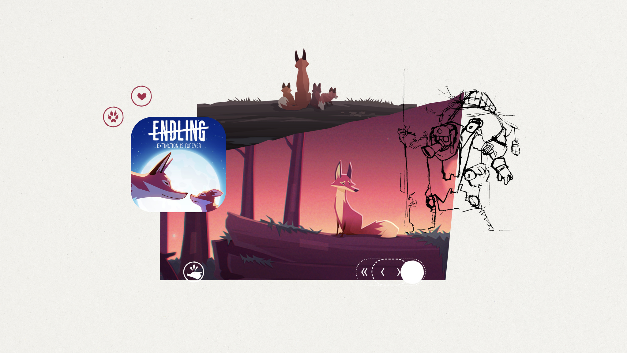
Behind the Design: Endling

Endling is all about survival in a changed world — and it’s a powerful mix of medium and message.

The game is a gorgeous adventure in which you play as a fox navigating a land charred by environmental disaster and human impact. Endling is not subtle — particularly when the fox starts defending its tiny offspring from an ever-increasing array of man-made dangers. Still, it draws players in with beautiful visuals, lush animations, a moody soundtrack, and brilliantly intuitive gameplay.

“It’s a survival game, but a simplified one that focuses more on telling a story,” says Philipp Nägelsbach, game designer and producer at HandyGames.

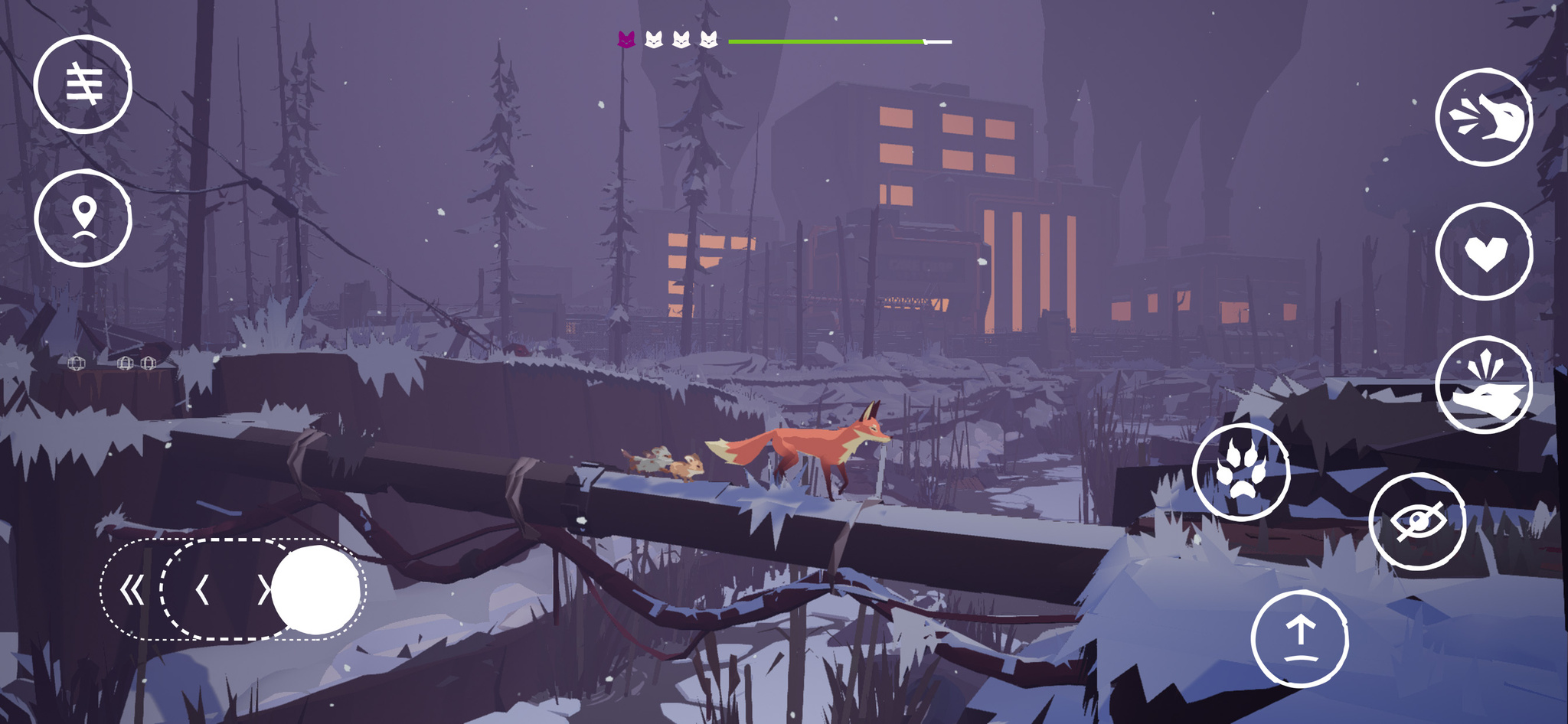
In *Endling*, you play as a lone fox navigating a land charred by human impact.

When creating such a game, balance is paramount. “You need to have cute scenes with the foxes safe in their lair, learning and growing,” says Nägelsbach. “And you have to have dramatic scenes to illustrate the real dangers.”

After an onboarding process that drops players into the heat of the action, the game becomes an open-world adventure that rewards exploration. That wasn’t always the case; Nägelsbach notes that the game’s earliest versions had a more linear structure. “It didn’t suit the message as well,” he says. “It’s much easier to show the ecological impact humans have when you visit the same spot several times and see a river that’s full of trash or a forest that’s been cut down.”

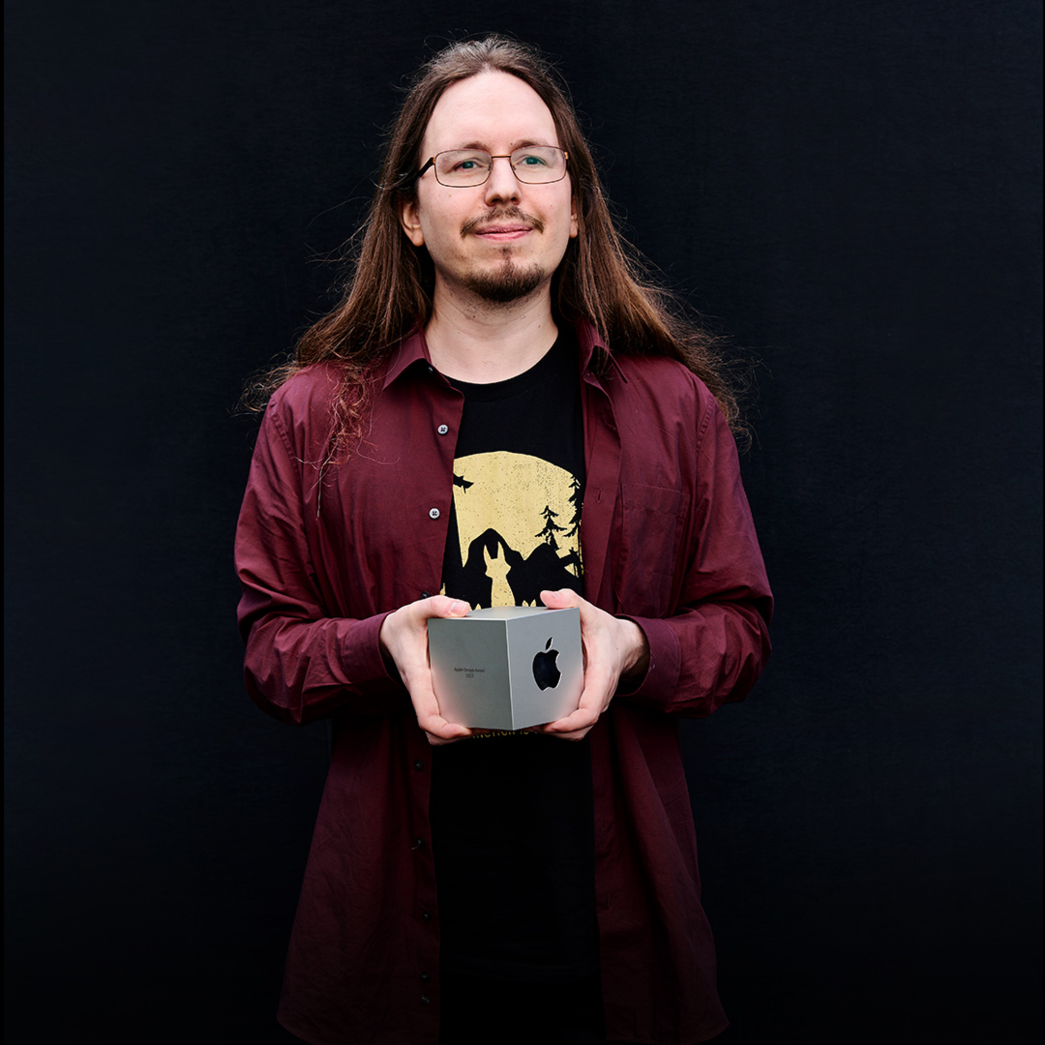
Philipp Nägelsbach, HandyGames

To control the fox, players operate a simple one-thumb control on the lower-left corner of the screen. The game gradually introduces additional interactions, like the ability to climb or jump over an obstacle. “That’s the moment people realize this isn’t entirely a side-scroller,” says Nägelsbach.

And then there’s the fox itself. Endling casts players as the animal in distress to create an instant sense of empathy — and their choice of animal was well-considered. “Foxes are some of the most adaptable animals in the world,” says Nägelsbach. “They’re not the biggest or smallest; they’re in the middle of the food chain. But if they’re close to extinction, things are really bad.”

It’s a survival game, but a simplified one that focuses more on telling a story.

Philipp Nägelsbach, game designer and producer at HandyGames

Doing so required numerous design considerations. The fox needed to be adorable enough to engage with, realistic enough to feel authentic, and believable enough to navigate the apocalyptic landscape. The fox doesn’t realize what’s happening to the environment; only the player recognizes the meaning of factories, careening trucks, and men in hazmat suits. “And the fox can only do things real foxes can do,” says Naegelsbach. “We couldn’t have the fox pushing buttons or solving complex puzzles.”

As the game progresses, you’re charged with protecting your tiny offspring from man-made dangers.

Extra attention was paid to the fox’s kits, who grow and develop unique personalities as the game goes on. Each kit represents a player’s life and has an instrument attached to it; when players lose kits, the game feels quieter and more lonely.

Nägelsbach says the teams did make adjustments to ensure the game wasn’t too severe, including the ability to replay parts of the story after a loss instead of starting over. The kits have only one owl enemy; they can’t be directly hurt by humans or dogs. And the fox’s cute bark is a mix of several different animal sounds. “In the real world, foxes aren’t very pleasant to listen to,” says Nägelsbach, “and you shouldn’t be annoyed by your protagonist.”

Endling ultimately delivers a message that sticks around long after gameplay ends. “The message is harsh,” says QA lead and producer Jan Pytlik, “but the game didn’t need to be harsh too. We worked and fine-tuned and I think we hit the mark.”

Learn more about Endling

Download Endling from the App Store

Behind the Design is a series that explores design practices and philosophies from each of the winners of the Apple Design Awards. In each story, we go behind the screens with the developers and designers of these award-winning apps and games to discover how they brought their remarkable creations to life.

Explore more of the 2023 Behind the Design series

Posted on Leave a comment

Spotlight on: Developing for visionOS

What’s it like to develop for visionOS? For Karim Morsy, CEO and co-founder of Algoriddim, “it was like bringing together all of the work we’ve built over many years.”

Algoriddim’s Apple Design Award-winning app djay has long pioneered new ways for music lovers and professional DJs alike to mix songs on Apple platforms; in 2020, the team even used hand pose detection features to create an early form of spatial gesture control on iPad. On Apple Vision Pro, they’ve been able to fully embrace spatial input, creating a version of djay controlled entirely by eyes and hands.

“I’ve been DJing for over twenty years, in all sorts of places and with all sorts of technology, but this frankly just blew my mind,” says Morsy. “It’s a very natural way to interact with music, and the more we can embrace input devices that allow you to free yourself from all these buttons and knobs and fiddly things — we really feel it’s liberating.”

“It’s emotional — it feels real.”

It’s a sentiment shared by Ryan McLeod, creator of Apple Design Award-winning puzzle game Blackbox. “You have a moment of realizing — it’s not even that interacting this way has become natural. There is nothing to ‘become natural’ about it. It just is!” he says. “I very vividly remember laughing at that, because I just had to stop for a moment and appreciate it — you completely forget that this [concept] is wild.”

Blackbox is famous on iOS for “breaking the fourth glass wall,” as McLeod puts it, using the sensors and inputs on iPhone in unusual ways to create dastardly challenges that ask you to do almost everything but touch the screen. Before bringing this experience to visionOS, however, McLeod had his own puzzle to solve: how to reimagine the game to take advantage of the infinite canvas offered by Vision Pro.

“You really have to go back to those first principles: What will feel native and natural on visionOS, and within a person’s world?” he says. “What will people expect — and what won’t they? How can you exist comfortably like that, and then tweak their expectations to create a puzzle, surprise, and satisfaction?”

After some early prototyping of spatial challenges, audio quickly became a core part of the Blackbox story. While McLeod and sound designer Gus Callahan had previously created sonic interfaces for the iOS app, Spatial Audio is bringing a new dimensionality to their puzzles in visionOS. “It’s a very fun, ineffable thing and completely changes the level of immersion,” he says. “Having sounds move past you is a wild effect because it evokes emotion — it feels real.”

“It will take you minutes to have your own stuff working in space.”

As someone who had exclusively developed for iOS and iPadOS for almost a decade — and had little experience with either 3D modeling or RealityKit — McLeod was initially trepidatious about trying to build an app for spatial computing. “I really hadn’t done a platform switch like that,” he says. But once he got started in Xcode, “there was a wild, powerful moment of recognizing how to set this up.”

visionOS is built to support familiar frameworks, like SwiftUI, UIKit, RealityKit, and ARKit, which helps apps like Blackbox bring over a lot of their existing codebase without having to rewrite from scratch. “What gets me excited to tell other developers is just — you can make apps really easily,” says McLeod. “It will take you minutes to have your own stuff working in space.”

Even for developers working with a more complex assortment of frameworks, like the team behind augmented reality app JigSpace, the story is a similar one. “Within three days, we had something up and running,” says CEO and co-founder Zac Duff, crediting the prowess of his team for their quick prototype.

One member of that team is JigSpace co-founder Numa Bertron, who spent a few days early in their development process getting to know SwiftUI. “He’d just be out there, learning everything he could, playing with Swift Playgrounds, and then he’d come back the next day and go: ‘Oh, boy, you won’t believe how powerful this thing is,’” Duff says.

Though new to SwiftUI, the JigSpace team is no stranger to Apple’s augmented reality framework, having used it for years in their apps to help people learn about the world using 3D objects. On Vision Pro, the team is taking advantage of ARKit features to place 3D objects into the world and build custom gestures for scaling — all while keeping the app’s main interface in a window and easily accessible.

JigSpace is also exploring how people can work together with SharePlay and Spatial Personas. “It’s a fundamental rethink of how people interact together around knowledge,” says Duff. “Now, we can just have you experience something right in front of you. And not only that — you can bring other people into that experience, and it becomes much more about having all the right people in the room with you.”

“You want to feel at home.”

Shared experiences can be great for education and collaboration, but for Xavi H. Oromí, chief engineering officer at XRHealth, it’s also about finding new and powerful ways to help people. While Oromí and his team are new to Apple platforms, they have significant expertise building fully immersive experiences: They were creating apps for VR headsets as early as 2012 in order to assist people in recognizing phobias, physical rehabilitation, mental health, and other therapy services.

Vision Pro immediately clicked for Oromí and the team, especially the fluidity of immersion that visionOS provides. “Offering some sort of gradual exposure and letting the person decide what that should look like — it’s something that’s naturally very integrated with therapy itself,” says Oromí.

With that principle as their bedrock, the team designed an experience to help people with acrophobia (fear of heights), built entirely with Apple frameworks. Despite having no prior development experience with Swift or Xcode, the team was able to build a prototype they were proud of in just a month.

In their visionOS app, a person can open a portal in their current space that gives them the feeling of being positioned at a significant height without fully immersing themselves in that app’s environment. For Oromí, this opens up new possibilities to connect with patients and help them feel grounded without overtaxing their comfort level. “You want to feel at home,” says Oromí, “The alternative before [in a completely immersive experience] was that I needed to remove the headset, and then I totally broke the immersion.”

It also has the added benefit of giving people a way to stay true to themselves. In some of their previous immersive experiences on other platforms, Oromí notes, patients’ hands and bodies were represented in the space using virtual avatars. But this had its own challenges: “We had a lot of patients saying that they felt their body was not theirs,” he says. “It’s very difficult for our society that’s so diverse to create representations of avatars that match everyone in the world… [In Vision Pro], where you can see your own body through the passthrough, we don’t need to create a representation.”

When combined with SharePlay, people can stay connected and supported with their virtual therapists while pushing their boundaries and challenging common fears. “Years from now, when we look back,” Oromí says, “we will be able to say it all started with the launch of Vision Pro — it’s where we truly enabled real virtual therapy.”

“You’re off to the races.”

When the SDK arrives later this month, developers worldwide will be able to download Xcode and start building their own apps and games for visionOS. With 46 sessions focused on Apple Vision Pro premiering at WWDC, there’s a lot of new knowledge to explore — but Duff and McLeod have a few supplemental recommendations.

“Pick up SwiftUI if you haven’t yet,” says McLeod, noting that getting to know the framework can help developers add core platform functionality to their existing app. He also suggests getting comfortable with basic modeling and Reality Composer Pro. “At some point, you’re gonna want to come off the page,” he says. But, he notes with a smile, you don’t need to become a 3D graphics expert to build for this platform. “You can get really far with a simple model and [Reality Composer Pro] shaders.”

Duff mirrors these recommendations, adding one last framework to the list: RealityKit. “If you’re transitioning from [other renderers] there are some fundamental changes you have to get to know,” he says. “But with those three things, you’re off to the races.”

Learn more about developing for visionOS and what you can do to get ready for the SDK on developer.apple.com.

Learn more about developing for visionOS

Prepare your apps for visionOS

Explore sessions about visionOS

Posted on Leave a comment

Meet visionOS

Get ready to design and build an entirely new universe of apps and games for Apple Vision Pro. Find out how developers of apps like djay, Blackbox, JigSpace, and XRHealth are starting to build for spatial computing.

We’ll show you how you can prepare for the visionOS SDK, help you learn about best-in-class frameworks and tools, and explore programs and events to help support you along your development journey.

Spotlight on: Developing for visionOS

Learn how the developers behind djay, Blackbox, JigSpace, and XRHealth started designing and building apps for Apple Vision Pro.

View now

Learn more about developing for visionOS

Prepare your apps for visionOS

Explore sessions about visionOS

Posted on Leave a comment

Introducing Apple Vision Pro and visionOS

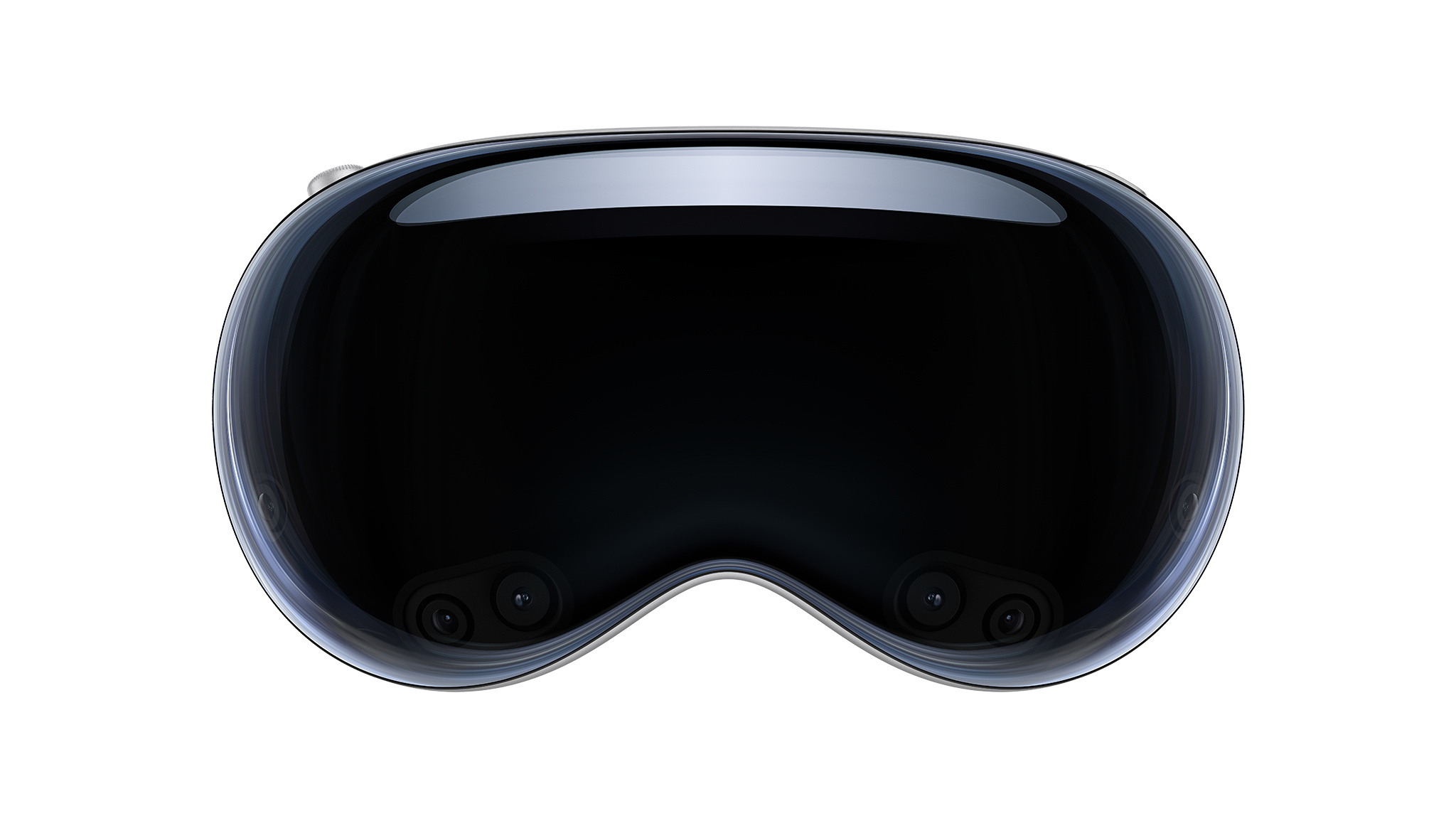
Apple Vision Pro is a revolutionary spatial computer that seamlessly blends digital content with the physical world, while allowing users to stay present and connected to others. Apple Vision Pro creates an infinite canvas for apps that scales beyond the boundaries of a traditional display and introduces a fully three-dimensional user interface controlled by the most natural and intuitive inputs possible — a user’s eyes, hands, and voice. Featuring visionOS, the world’s first spatial operating system, Apple Vision Pro lets users interact with digital content in a way that feels like it is physically present in their space. The breakthrough design of Apple Vision Pro features an ultra-high-resolution display system that packs 23 million pixels across two displays, and custom Apple silicon in a unique dual-chip design to ensure every experience feels like it’s taking place in front of the user’s eyes in real time.

Discover the resources you can use to bring your spatial computing creations to life with a new, yet familiar, way to build apps that reimagine what it means to be connected, productive, and entertained.

Learn more about visionOS