Posted on Leave a comment

How to Use ChatGPT as Your Stock Analyst ($NVDA)

The average financial analyst makes bw $88k and $101k per year in the US. Can they be replaced by AI?

Absolutely!

Check out this NVDA discounted cash flow analysis with ChatGPT 5.1 Thinking: 👇

In this video, you’ll learn how to use the thinking model ChatGPT 5.1 to perform a discounted cash flow analysis of any stock – easily and without needing external APIs. I use NVidia as an example but you can run the same steps with any stocks. This replaces $100k/y stock analysts jobs on Wall Street.

Truly insane!


♥ Join our free email newsletter to stay on the right side of change: 👉 https://blog.finxter.com/ai/

👨‍💻 SHIP! One Project Per Month (Builder Community Skool): https://www.skool.com/ship-one-project-per-month-9458/about

The post How to Use ChatGPT as Your Stock Analyst ($NVDA) appeared first on Be on the Right Side of Change.

Posted on Leave a comment

This Finviz Screener Finds Recession-Proof Stocks — Four Variables Suggested by AI

Disclaimer: This is not investment advice – just financial entertainment.

TLDR: These are the four variables to screen to find recession proof stocks according to financial research (e.g., Morningstar)

  • 1. Dividend Yield  1% or more
  • 2. Low Debt/Equity (preferably less than 1)
  • 3. Low Beta (e.g., Beta less than  1)
  • 4. High Return on Equity (ROE greater than 10%)

Here’s the video I recorded:

What is a Recession?

A recession is simply a broad, painful slowdown in the economy: falling output, jobs, incomes, production, and sales (that’s how the NBER defines it).

Since 1945 the U.S. has seen 13 recessions, roughly one every six years, usually lasting around 10 months.

Consumer spending makes up about two-thirds of the U.S. economy, so when people cut back, companies tied to “nice-to-have” stuff get hit much harder than those selling necessities.

Interestingly, stocks have still been up on average during recessions, so the question isn’t “stocks or no stocks?” but “which stocks?”.

The Finviz Recession Filter Suggested by State-of-the-Art AI Agents

Filter 1 – Dividend yield ≥ 1%
Dividends matter because over long periods a big chunk of stock returns comes from reinvested dividends, not just price moves. Hartford Funds found that since 1960, reinvested dividends made up the majority of the S&P 500’s total return. But chasing super-high yields is dangerous: in 2020, a popular high-dividend index actually fell more than the market because some companies couldn’t keep paying. So in the screener we just ask for a modest dividend (≥ 1%) to find companies that share cash with investors without diving into “desperate high-yield” land.

Filter 2 – Debt-to-equity < 1
In a recession, too much debt can turn a slowdown into a crisis for a company. MIT Sloan research on the Great Recession showed that firms that loaded up on debt before 2008 were forced to cut jobs and close locations far more than low-debt firms. High interest costs plus falling sales is a brutal combo. So we add a simple filter: debt-to-equity below 1, which nudges us toward companies with healthier balance sheets and more breathing room when things get ugly.

Filter 3 – Beta < 1
“Beta” measures how much a stock typically moves compared to the overall market. AllianceBernstein studied global stocks back to the 1970s and found that the least volatile 20% of stocks actually returned about one-third more than the market with roughly 20% less volatility, and they held up better in 7 of the last 8 major downturns. That’s the “lose less in crashes, compound more over time” effect. So we tell the screener: beta under 1, focusing on stocks that historically swing less than the index.

Filter 4 – Return on equity (ROE) > 10%
Return on equity is a simple profitability metric: how much profit a company generates per dollar of shareholder equity. WisdomTree cites research showing that, over almost 60 years, the highest-ROE companies beat the lowest-ROE companies by about 4 percentage points per year on average. High-ROE businesses tend to have strong competitive positions and more resilient earnings. So we add one last filter: ROE above 10% to favor consistently profitable companies that are more likely to sustain dividends and survive downturns.


Also check out my related article:

👉 12 Ways to Make Money with AI

References

NBER recession basics: https://www.nber.org/research/business-cycle-dating
Hartford Funds – 10 Things You Should Know About Recessions: https://www.hartfordfunds.com/dam/en/docs/pub/whitepapers/CCWP079.pdf
Hartford Funds dividends/total return (via InvestorPlace summary): https://investorplace.com/2024/01/3-reasons-to-rely-on-dividend-stocks/
MIT Sloan – Corporate debt and layoffs in the Great Recession: https://mitsloan.mit.edu/press/companies-took-more-debt-run-to-great-recession-later-cut-employment-more-sharply-says-new-research-mit-sloans-xavier-giroud
AllianceBernstein – The Paradox of Low-Risk Stocks: https://www.alliancebernstein.com/apac/en/institutions/insights/investment-insights/the-paradox-of-low-risk-stocks-gaining-more-by-losing-less.html
WisdomTree – Why Quality for the Long Run (ROE spread): https://www.wisdomtree.com/investments/blog/2021/08/24/why-quality-for-the-long-run

The post This Finviz Screener Finds Recession-Proof Stocks — Four Variables Suggested by AI appeared first on Be on the Right Side of Change.

Posted on Leave a comment

Restoring Images with Gemini Banana Pro 🍌 (Before/After Examples)

See how old, torn, and blurry photos can be transformed into clear, high-quality images. This article demonstrates the power of digital restoration with real before-and-after examples that make damaged memories look brand new.

✨ Tools: I used Google Gemini Banana Pro to create the image restorations.

Example 1: New York 1920s

Before:

After:


Example 2: Disco 1980s

Before:

After:

Example 3: Puppy

Before:

After:

Example 4: Czech Immigrant

Before:

After:


Posted on Leave a comment

Modelling TSLA. How many humanoids in 2030?

Elon targets billions of robots – but, understandably, doesn’t provide super clear guidance on the growth story (that I’m aware of).

Everybody agrees on the importance of Optimus for TSLA investment case.

We can ball-park the profit per TSLA bot in the long-term ($5k – $50k lifetime value for TSLA)

How many TSLA bots will we have though? Say 12/31/2035

I feel there are 2-3 orders of magnitude variation so I thought a quick poll might be useful (collective intelligence).

Why is this relevant?

Here’s a very simple profit model as a function of number of units and profit per unit (NFA):

  • 0.1M bots @ $5k LTV ==> $0.5B profit
  • 1M bots @ $10k LTV ==> $10B profit
  • 10M bots @ $10k LTV ==> $100B profit
  • 1B bots @ $15k LTV ==> $15T profit

The profit story is more dependent on the number of humanoids and less dependent on the profit per unit.

The number of units dominates the profit story.

Tesla aims to produce 1M bots per year by 2030 but how will the growth look like?

Here’s a sand-bagged case from Elon’s target of 1M robots produced in 2030:

  • 2025: 2,000
  • 2026: 8,000
  • 2027: 40,000
  • 2028: 150,000
  • 2029: 300,000
  • 2030: 500,000 <– cumulative 1,000,000 units produced by end of 2030
  • 2031: 1,500,000
  • 2032: 3,000,000
  • 2033: 5,000,000
  • 2034: 7,000,000
  • 2035: 10,000,000

That would yield a rough 10M x $10k = $100B profit in 2035. The humanoid segment market cap could be 20-40 time that, i.e., $2T-$4T.

The post Modelling TSLA. How many humanoids in 2030? appeared first on Be on the Right Side of Change.

Posted on Leave a comment

Finviz Screening for Magic Formula Investing (High ROC, Low P/E)

Learn how to apply Joel Greenblatt’s legendary ‘Magic Formula’ investing strategy without paying for expensive software.

I’ll break down the core math behind buying good companies at cheap prices (High Return on Capital + High Earnings Yield) and give you a step-by-step tutorial on setting up a custom scan in Finviz.

Watch to see exactly how to filter the market to find the best potential value stocks for your portfolio right now:

Specifically, follow these four steps:

Finviz screenshotzz
  1. Go to Finviz > Screener and select the Fundamental tab
  2. Choose P/E > Low (<15)
  3. Click Financial Tab
  4. Sort by ROA (=Return on Assets) or ROE (=Return on Equity) by clicking on the respective column.
Posted on Leave a comment

ChatGPT 5.1 vs Gemini Banana Pro – Which Creates the Best Fake Monet?

I just finished this video comparing which AI model is better in building a Monet clone image:


This is the first image generated by ChatGPT 5.1:

This one nails the sunny summer vibe with those bright colors, but it’s honestly way too orange and saturated to pass for a real Monet. The generic ‘ART’ and ‘CAFFE’ signs look kind of fake, like something you’d find on a jigsaw puzzle rather than in a museum. It’s a pretty picture, but it feels more like modern home decor than a 19th-century masterpiece.


This is the second image generated by Google Gemini Banana Pro:

This one is much closer to the real deal, capturing that classic hazy look and the specific blue shadows that Monet actually used. It falls apart a bit when you zoom in on the weird, gibberish text and the blurry faces, which are dead giveaways for AI. Still, if you squint, this one definitely wins for feeling the most like an actual historical painting.

The post ChatGPT 5.1 vs Gemini Banana Pro – Which Creates the Best Fake Monet? appeared first on Be on the Right Side of Change.

Posted on Leave a comment

.NET Day on Agentic Modernization Coming Soon

Join us on December 9, 2025 between 9AM-1PM Pacific for .NET Day of Agentic Modernization! This is a free, one-day virtual event focused on the latest tooling, techniques, and guidance for modernizing your .NET applications. Whether you’re upgrading legacy code, preparing for cloud workloads, or exploring how AI and agentic patterns fit into your architecture, this event will show you what’s possible with today’s tooling while keeping reliability, security, and developer control front and center. Buckle up because we’ll be demo heavy and you can get your questions answered live!

.NET Day on Agentic Modernization event banner

Agenda

We have 8 great sessions throughout the event that will be broadcast live. Tune in and get your questions answered from the presenters!

🚀 Choose Your Modernization Adventure with GitHub Copilot with Brady Gaster – See how GitHub Copilot and Visual Studio speed app modernization- upgrading code, fixing dependencies, and guiding secure, cloud-ready migrations into Azure.

⚙️ Agentic DevOps: Enhancing .NET Web Apps with Azure MCP with Yun Jung Choi – Learn how AI-powered tooling and Azure MCP streamline .NET app development-code, storage, SQL, and IaC workflows-with faster, smarter Azure-ready delivery.

🛡️ Fix It Before They Feel It: Proactive .NET Reliability with Azure SRE Agent with Deepthi Chelupati and Shamir Abdul Aziz – See how Azure SRE Agent and App Insights detect .NET regressions, automate rollbacks, and streamline incident prevention with custom agents and health checks.

☁️ No‑Code Modernization for ASP.NET with Managed Instance on Azure App Service with Andrew Westgarth and Gaurav Seth – See how Azure App Service Managed Instance removes ASP.NET migration blockers-enabling fast modernization, better performance, lower TCO, and integration with modern agentic workflows.

🤖 Modernization Made Simple: Building Agentic Solutions in .NET with Bruno Capuano – Learn how to add the Agent Framework to existing .NET apps – unlocking multi-agent collaboration, memory, and tool orchestration with practical, fast-start guidance.

💪 Bulletproof Agents with the Durable Task Extension for Microsoft Agent Framework with Chris Gillum and Thiago Almeida – See how the Durable Extension for the Microsoft Agent Framework brings durable, distributed, deterministic, and debuggable AI agents to Azure—enabling reliable, scalable, production-ready agentic workflows.

🔐 Securely Unleash AI Agents on Azure SQL and SQL Server with Davide Mauri – Learn how to let AI agents work safely with Azure SQL – enforcing strict security, least-privilege access, and schema-aware techniques that prevent data leaks and query errors.

Secure and Smart AI Agents Powered by Azure Redis with Catherine Wang – See how Azure Redis powers secure, streamlined data access for .NET agentic apps – using MCP, Redis-backed tools, and modern security patterns to simplify development.

Tune in

Don’t miss this opportunity to get practical, real-world guidance on modernizing .NET applications for Azure, AI, and agentic patterns. Mark your calendars and get ready for .NET Day on Agentic Modernization!

Posted on Leave a comment

Best Free Books for Distributed Systems PhD Students (Must Read!)

Distributed systems form the backbone of modern large-scale computing, from cloud platforms to distributed databases and large clusters.

As a PhD student, you need resources that go beyond the basics, combining strong theoretical foundations with practical insights. And ideally, they should be freely accessible.

The following five books are all legally available online at no cost and are well-suited to accompany you through graduate-level research in distributed systems.

Distributed Systems (4th Edition) — Maarten van Steen & Andrew S. Tanenbaum

This modern classic offers a broad and rigorous introduction to distributed systems, covering architectures, communication, naming, coordination, replication, fault tolerance, and security. The 4th edition updates many examples to reflect today’s large-scale systems and is widely used in advanced undergraduate and graduate courses. A personalized digital copy is available for free from the authors’ website.

Access the free digital edition

Distributed Systems for Fun and Profit — Mikito Takada

Short, opinionated, and surprisingly deep, this book is great when you want to quickly grasp the core concepts behind real-world distributed systems. It walks through consistency models, time and ordering, replication strategies, and the design of systems like Dynamo and Bigtable, always with an eye toward what matters in practice. Its informal style makes it perfect as a first pass or as a companion to more formal texts.

Read the book online for free

The Datacenter as a Computer: Designing Warehouse-Scale Machines (3rd Edition) — Luiz André Barroso, Urs Hölzle, Parthasarathy Ranganathan

If you’re doing a PhD, you’ll likely care about how your algorithms and systems behave at data-center scale. This open-access book treats an entire datacenter as a single “warehouse-scale computer” and explains how to design, operate, and optimize such systems. It’s particularly valuable for understanding the hardware, energy, and reliability constraints behind large distributed services such as those run by major cloud providers.

Download the open-access book (PDF and more)

Operating Systems: Three Easy Pieces — Remzi H. Arpaci-Dusseau & Andrea C. Arpaci-Dusseau

While technically an operating-systems book, OSTEP is essential background for anyone doing serious work in distributed systems. Its deep treatment of concurrency, synchronization, and persistence provides the building blocks that distributed algorithms and storage systems rely on. The clear structure, numerous exercises, and freely available PDFs make it ideal for self-study alongside more specialized distributed-systems material.

Access the free online textbook and PDFs

Distributed Algorithms — Jukka Suomela

These lecture notes form a full-fledged graduate-level textbook on distributed algorithms, focusing on rigorous models and proofs. Topics include locality, symmetry breaking, graph problems, and complexity in distributed settings, making it an excellent bridge between theory and the systems-oriented books above. If your PhD work touches consensus, graph algorithms on networks, or lower bounds in distributed computing, this text is a highly relevant free resource.

Download the lecture-notes textbook as PDF


Also check out my other free book articles:

👉 42 Best Free AI Books (HTML/PDF)

Posted on Leave a comment

React Charts and Graphs with Recharts: Visualize Data Beautifully

by Vincy. Last modified on December 3rd, 2025.

Representing data in a chart view is a huge subject in Mathematics and Computer Science. If you have the skill to transform raw numbers into a chart view, it’s a brilliant representation that makes users understand any complex data quickly.

Learning to build a chart in React will elevate your UI and make your application feel truly professional.

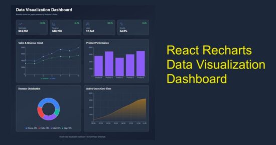
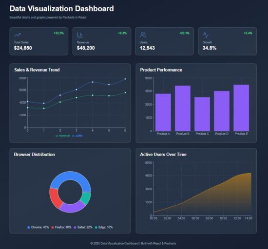
This React example includes dashboard visualization to display the following chart view.

  1. Sales & revenue trend in the form of line chart.
  2. Product-wise performance using column chart.
  3. Browser distribution in pie chart.
  4. Area chart to visualize users’ active time.

It uses Recharts library to show the raw data in a graph or chart form, as shown below.

React Charts Graphs Recharts Data Visualization

Main React component containing chart components

The DataVisualization component manages React states and useEffect. It manages the separate state variables for each type of charts.

The React useEffect fetches the JSON data and set them to bind for the charts.

The chart UI are created as separate components and used in the dashboard wrapper.

src/components/DataVisualization.jsx

import { useState, useEffect } from "react";
import Header from "../components/Header";
import StatsCards from "../components/StatsCards";
import LineChartBox from "../components/LineChartBox";
import BarChartBox from "../components/BarChartBox";
import PieChartBox from "../components/PieChartBox";
import AreaChartBox from "../components/AreaChartBox";
import Footer from "../components/Footer"; const DataVisualization = () => { const [lineData, setLineData] = useState([]); const [barData, setBarData] = useState([]); const [pieData, setPieData] = useState([]); const [areaData, setAreaData] = useState([]); useEffect(() => { fetch("/data/dashboard.json") .then((res) => res.json()) .then((data) => { setLineData(data.lineData); setBarData(data.barData); setPieData(data.pieData); setAreaData(data.areaData); }) .catch((err) => console.error("Error loading data:", err)); }, []); return ( <div className="dashboard-wrapper"> <div className="dashboard-container"> <Header /> <StatsCards /> <div className="charts-grid"> <LineChartBox data={lineData} /> <BarChartBox data={barData} /> <PieChartBox data={pieData} /> <AreaChartBox data={areaData} /> </div> <Footer /> </div> </div> );
};
export default DataVisualization;

Chart visualization header with trending data cards

In this code, the chart components are created for rendering in a dashboard. Added to the chart representation, the dashboard shows cards to display trending data.

You can replace it with your applications progressive data in this cards. For demonstration purpose, they are all static data from the client-side. It’s a matter of minute to plug your dynamic data from the database.

react chart graph visualization header

src/components/Header.jsx

const Header = () => ( <header className="dashboard-header"> <h1>Data Visualization Dashboard</h1> <p>Beautiful charts and graphs powered by Recharts in React</p> </header>
);
export default Header;

react chart graph statscards

src/components/StatsCards.jsx

import { TrendingUp, BarChart3, Users, Activity } from "lucide-react";
const StatsCards = () => { const stats = [ { icon: <TrendingUp strokeWidth={1} />, label: "Total Sales", value: "$24,850", change: "+12.5%" }, { icon: <BarChart3 strokeWidth={1} />, label: "Revenue", value: "$48,200", change: "+8.2%" }, { icon: <Users strokeWidth={1} />, label: "Users", value: "12,543", change: "+23.1%" }, { icon: <Activity strokeWidth={1} />, label: "Growth", value: "34.8%", change: "+5.4%" }, ]; return ( <div className="stats-grid"> {stats.map((stat, index) => ( <div key={index} className="stat-card"> <div className="stat-top"> <span className="stat-icon">{stat.icon}</span> <span className="stat-change">{stat.change}</span> </div> <p className="stat-label">{stat.label}</p> <p className="stat-value">{stat.value}</p> </div> ))} </div> );
};
export default StatsCards;

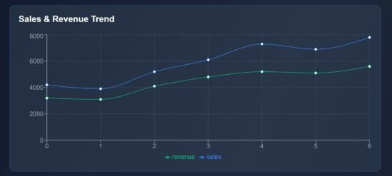
Line chart to show the sales revenue graph

This script imports the Recharts component required for rendering a line chart. The following components are mostly required for all the charts.

  • XAxis, YAxis
  • Tooltip and Legend
  • CartisanGrid
  • ResponsiveContainer

The chart is rendered in a ResponsiveContainer block which support chart scaling based on the viewport size. The Tooltip and CartisanGrid will be shown on hovering the chart. The X,Y axis and chart legend are very usual part of the chart view.

The LineChart and Line components are exclusive to this type of chart. It accepts Recharts attributes to set the stroke width and color of the line graph.

react data visualization line chart

src/components/LineChartBox.jsx

import { LineChart, Line, XAxis, YAxis, Tooltip, CartesianGrid, Legend, ResponsiveContainer } from "recharts";
const LineChartBox = ({ data }) => ( <div className="chart-card"> <h2>Sales & Revenue Trend</h2> <ResponsiveContainer width="100%" height={300}> <LineChart data={data}> <CartesianGrid strokeDasharray="3 3" stroke="#475569" /> <XAxis stroke="#94a3b8" /> <YAxis stroke="#94a3b8" /> <Tooltip /> <Legend /> <Line type="monotone" dataKey="sales" stroke="#3b82f6" strokeWidth={1} /> <Line type="monotone" dataKey="revenue" stroke="#10b981" strokeWidth={1} /> </LineChart> </ResponsiveContainer> </div>
);
export default LineChartBox;

Bar chart fir showing performance graph

The BarChart and Bar component of the Recharts library are used in this script. The BarChart accepts chart data and Bar element requires the color specification to fill the column bar.

src/components/BarChartBox.jsx

import { BarChart, Bar, XAxis, YAxis, Tooltip, CartesianGrid, ResponsiveContainer } from "recharts";
const BarChartBox = ({ data }) => ( <div className="chart-card"> <h2>Product Performance</h2> <ResponsiveContainer width="100%" height={300}> <BarChart data={data}> <CartesianGrid strokeDasharray="3 3" stroke="#475569" /> <XAxis dataKey="category" stroke="#94a3b8" /> <YAxis stroke="#94a3b8" /> <Tooltip /> <Bar dataKey="value" fill="#8b5cf6" /> </BarChart> </ResponsiveContainer> </div>
);
export default BarChartBox;

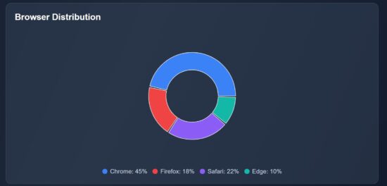
Pie chart – Recharts – showing browser distribution

This Recharts component accepts the inner-radius, outer-radius, cy, cx properties to draw the pie chart.

This chart type will have a Pie component which is to draw the pie wedges in the wrapper. The Cell is to draw each pie slices.

It receives the data and datakey in the <Pie /> component of this Recharts library.

react data visualization pie chart

src/components/PieChartBox.jsx

import { PieChart, Pie, Tooltip, ResponsiveContainer, Cell } from "recharts";
const PieChartBox = ({ data }) => ( <div className="chart-card"> <h2>Browser Distribution</h2> <ResponsiveContainer width="100%" height={300}> <PieChart> <Pie data={data} dataKey="value" innerRadius={60} outerRadius={100} paddingAngle={2} cx="50%" cy="50%" > {data.map((entry, i) => ( <Cell key={i} fill={entry.color} /> ))} </Pie> <Tooltip /> </PieChart> </ResponsiveContainer> <div className="pie-legend"> {data.map((item, i) => ( <div key={i} className="legend-item"> <span className="legend-color" style={{ background: item.color }} /> <span>{item.name}: {item.value}%</span> </div> ))} </div> </div>
);
export default PieChartBox;

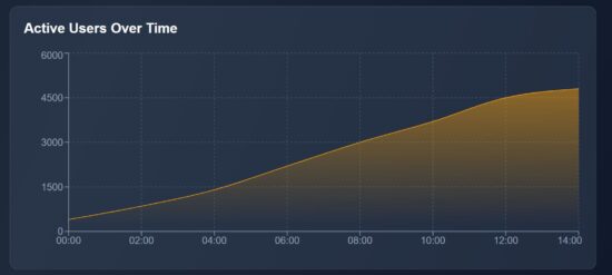
Area chart using the Recharts library

In this graph, it shows the active users count by time. It represents how many users are actively using your app at a particular point of time. It will help to monitor the spikes and drop in the traffic, product or services usages and more.

The AreaChart is the wrapper that contains the Area element which is to show the shaded part of the chart as shown below.

The JSON data contains the time and user count for each level of the graph. The area is highlighted within a LinearGadient definition.

react data visualization area chart

src/components/AreaChartBox.jsx

import { AreaChart, Area, XAxis, YAxis, Tooltip, CartesianGrid, ResponsiveContainer } from "recharts";
const AreaChartBox = ({ data }) => ( <div className="chart-card"> <h2>Active Users Over Time</h2> <ResponsiveContainer width="100%" height={300}> <AreaChart data={data}> <defs> <linearGradient id="colorUsers" x1="0" y1="0" x2="0" y2="1"> <stop offset="5%" stopColor="#f59e0b" stopOpacity={0.8} /> <stop offset="95%" stopColor="#f59e0b" stopOpacity={0} /> </linearGradient> </defs> <CartesianGrid strokeDasharray="3 3" stroke="#475569" /> <XAxis dataKey="time" stroke="#94a3b8" /> <YAxis stroke="#94a3b8" /> <Tooltip /> <Area type="monotone" dataKey="users" stroke="#f59e0b" fill="url(#colorUsers)" /> </AreaChart> </ResponsiveContainer> </div>
);
export default AreaChartBox;

react chart graph data visualization

Conclusion

The React charts provide graphical view to understand your trending data. The line chart plots the performance range over time, the pie chart slices down browser distribution at a quick view, and the area chart visualizes the user activity patterns. By using Recharts responsive wrapper, each graph fit for different screen size. Overall, these charts transform raw numbers into visual stories to help efficient decision making.

References:

  1. Recharts library documentation
  2. Best chart libraries for React

Download

Vincy
Written by Vincy, a web developer with 15+ years of experience and a Masters degree in Computer Science. She specializes in building modern, lightweight websites using PHP, JavaScript, React, and related technologies. Phppot helps you in mastering web development through over a decade of publishing quality tutorials.

↑ Back to Top